Problem Statement
The resort and hospitality chain faces critical challenges regarding the outdated user interface (UI) of its applications (Kiosk & Mobile Applications). Over the time, technological advancements have rendered the existing UI obsolete, resulting in a visually unappealing and functionality deficient experience for customers.
Client wanted to have the same Information Architecture without changing the screen counts and features. The lack of modern design elements and features hinders the client’s ability to provide customers with efficient tools for searching, checking, booking and purchasing products and services. The outdated UI not only compromises the brand’s image but also diminishes the overall user satisfaction and engagement levels.
Therefore, there is an urgent need to reimagine the interface of the client’s application retaining the existing Information Architecture while infusing the design principles and functionalities.
The Solution
To address the Resort and Hospitality chain’s challenge of outdated UI and enhance the overall user experience (UX) for both kiosk and mobile applications, a comprehensive solution is proposed. The solution begins with work around the insights provided by the client (No research work held due to client's budget) to understand the target audience’s needs, preferences, and pain points, followed by clear definition of design goals aligned with business objectives and user needs.
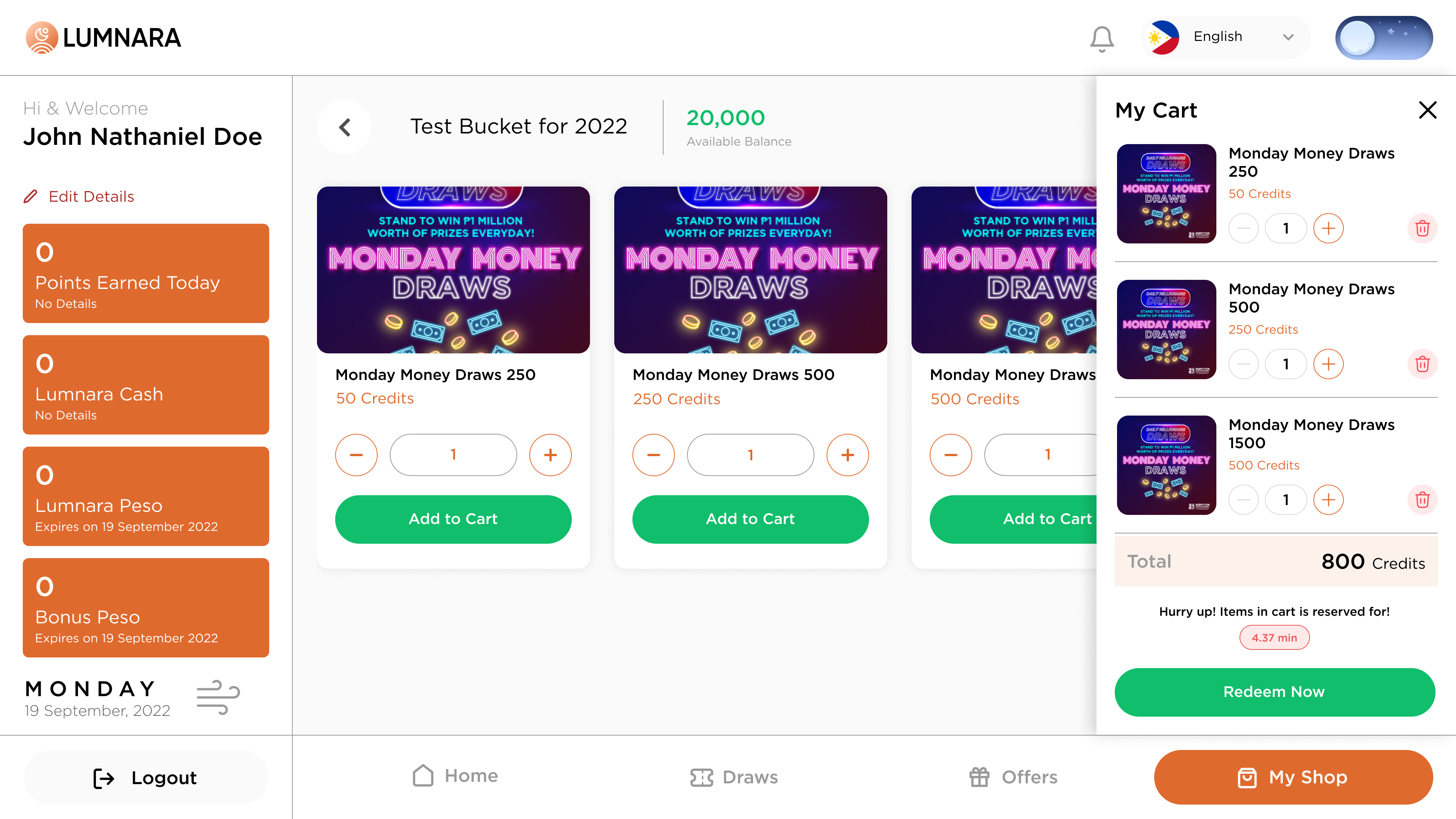
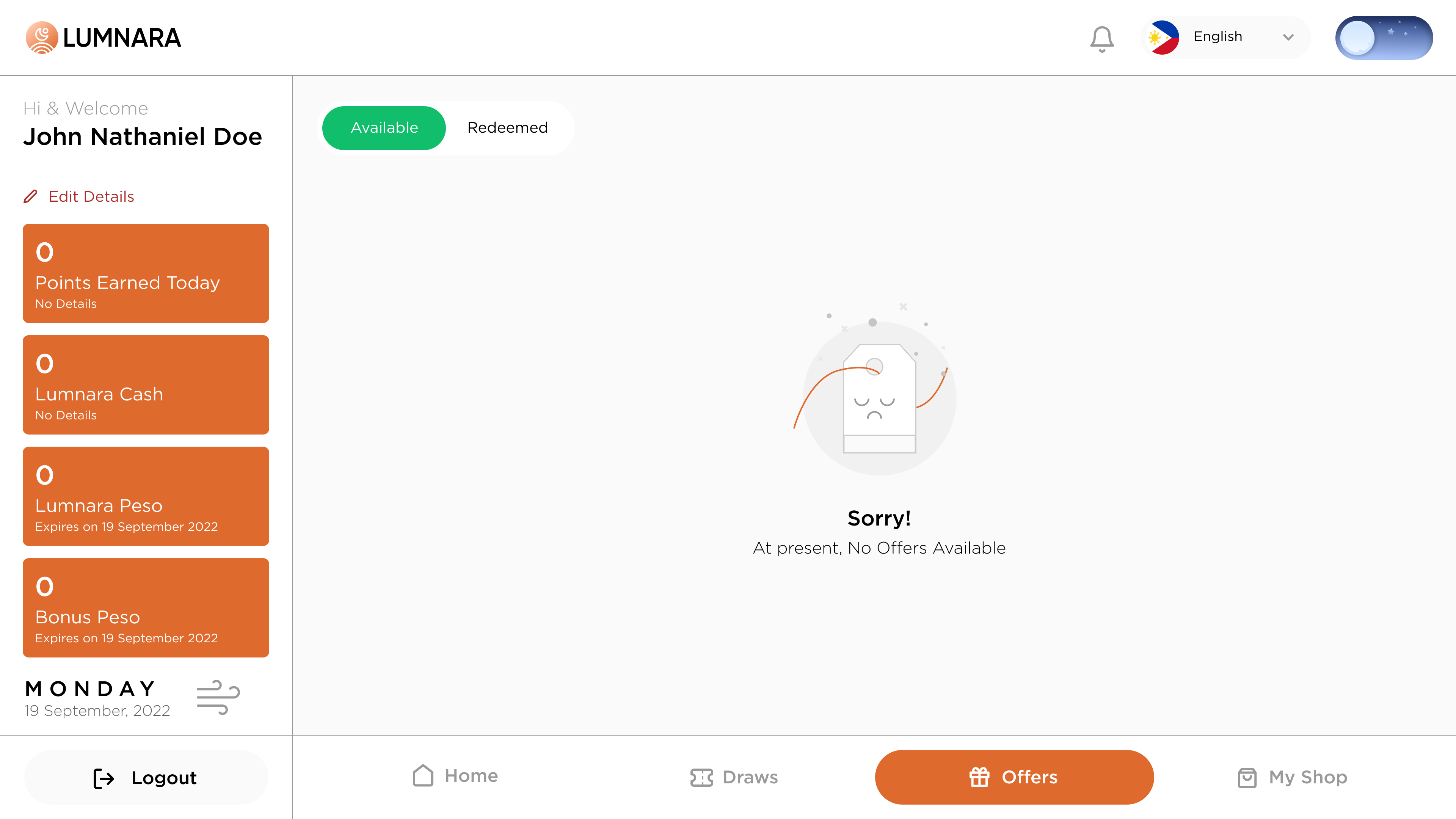
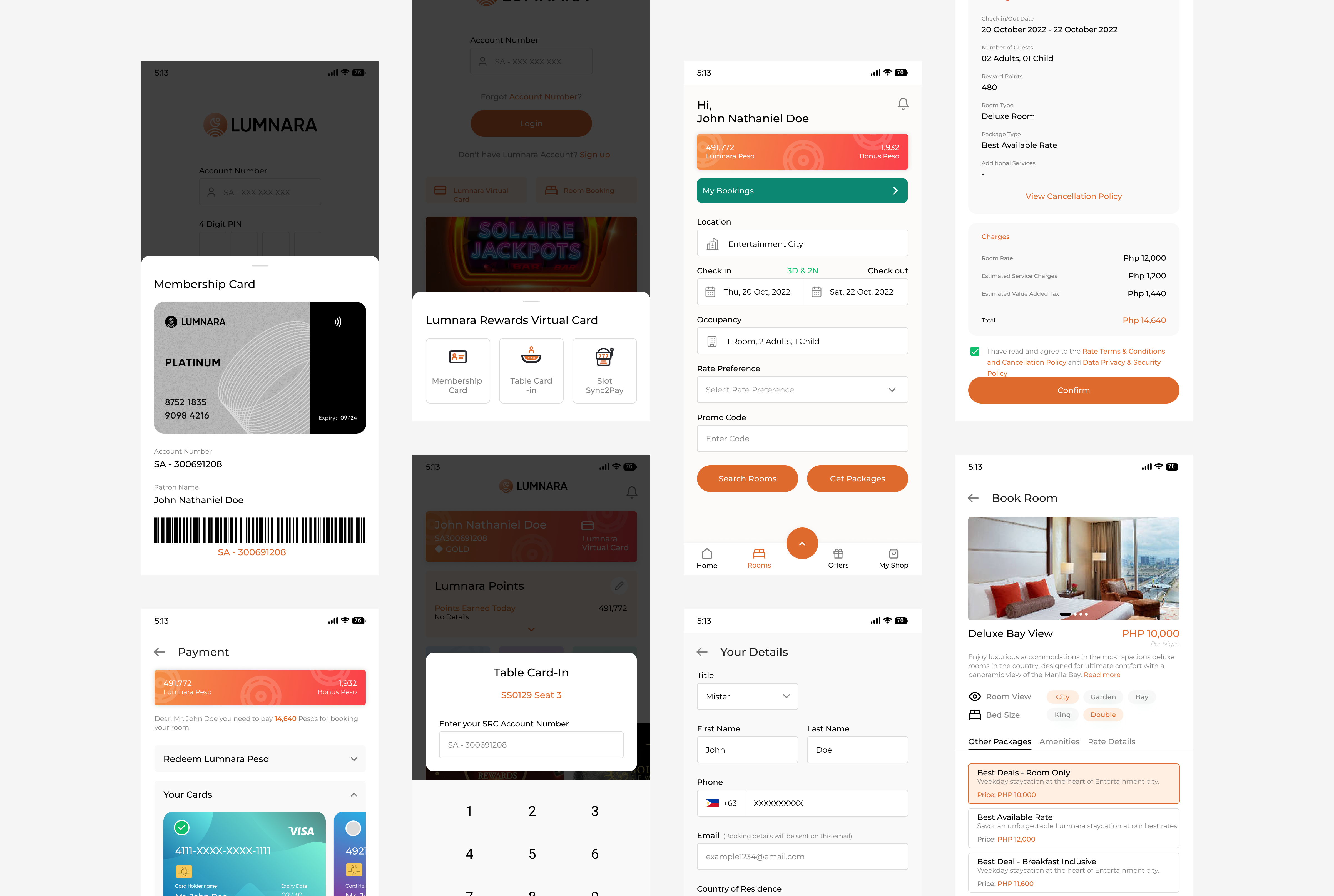
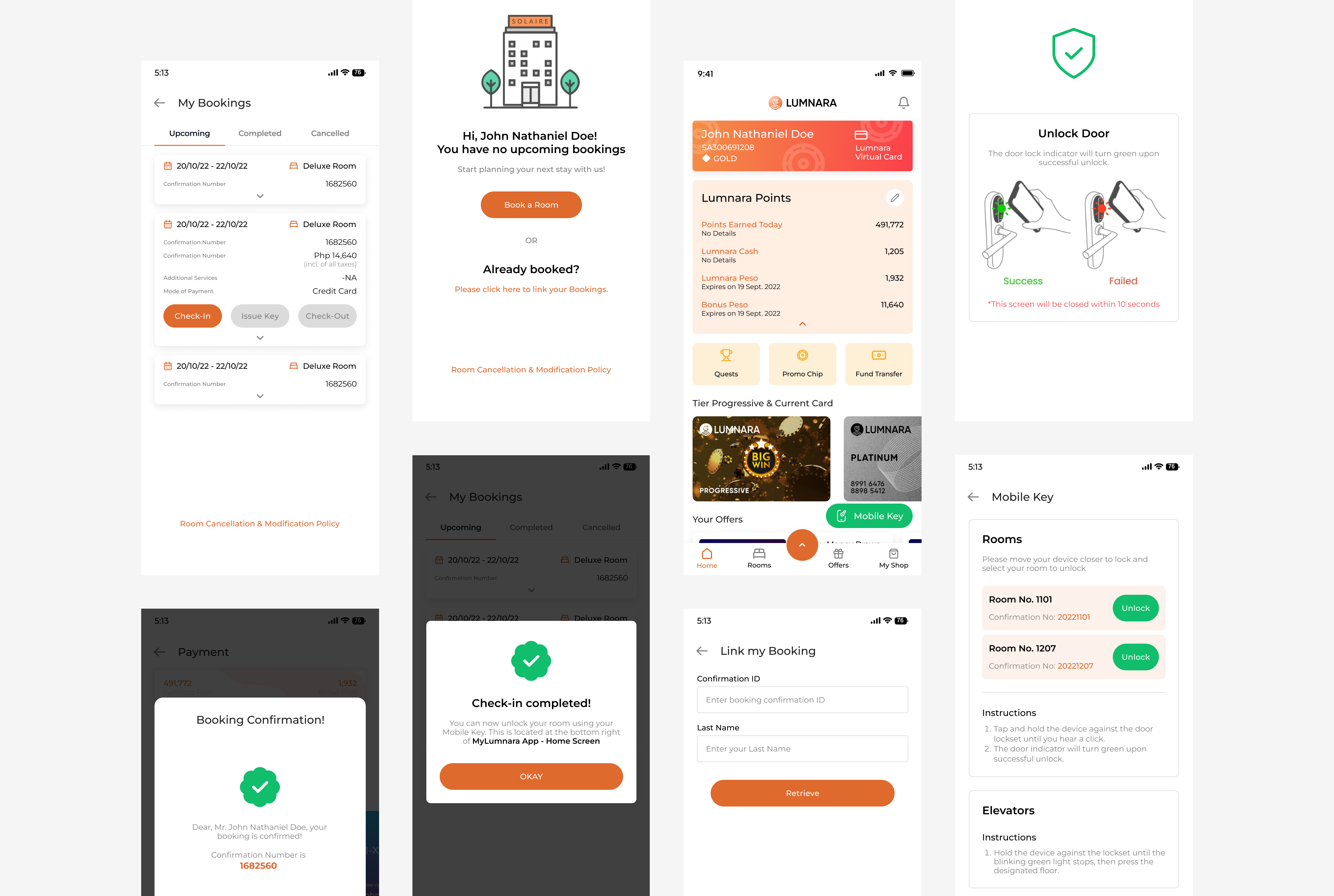
Keeping the idea in mind to not change the existing Information Architecture and to ensure its relevance and intuitiveness, while a modern and visually appealing UI design incorporates contemporary elements, typography, and color schemes, ensuring consistency across various devices. Also incorporating the enhanced features such as advanced search functionality, Light-Dark color modes, more intuitive UI components and end-user usability
My Engagement into seamless UX experience
As a seasoned UX designer, I was entrusted with a pivotal role in shaping the user experience and visual design of a client. My responsibilities includes a hybrid approach, encompassing both UX and visual design aspects. I started with conducting comprehensive UX analysis of the existing system to identify the ux challenges and pain points in the current user interface and experience.
Leveraging this analysis I rectified the visual designs and experience with creation of low-Fi wireframes, engaging ideation sessions and meticulously crafting Hi-Fi designs. Throughout this iterative process. I remain committed to collaborating closely with stakeholders, and product team (including Product owner, Manager, Business Analyst, Developers and tester) seeking their inputs and feedback, and conducting thorough testing to validate design decisions by fostering a user-centric approach and prioritizing usability and aesthetic appeal. I strive to deliver a seamless and engaging user experience for our users elevating the apps functionality and delighting audience.
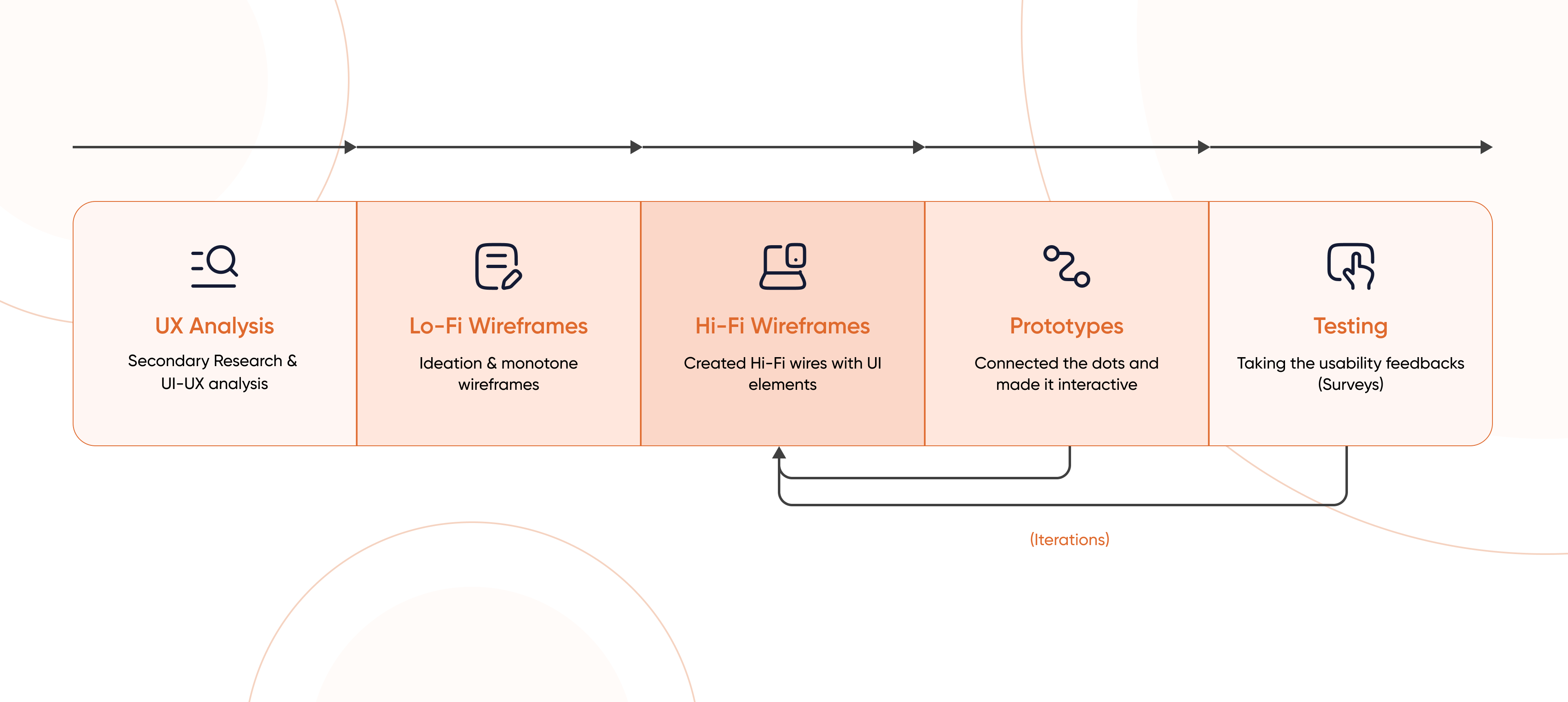
My Process
I began by collaborating with stakeholders and product owners to understand the business requirements and user pain points. Since there was no opportunity for extensive user research, I relied on stakeholder insights to identify key challenges.
To kick off the redesign, I analyzed existing kiosk and mobile app screenshots, conducting a UX audit and heuristic evaluation. This helped pinpoint usability flaws, inconsistencies, and areas needing improvement.
With these insights, I structured a user-centric design approach—addressing the flaws through wireframes that streamlined navigation, improved accessibility, and enhanced the overall user experience.
Key insights from stakeholders
67%
of users reported navigation is unintuitive and not easy discoverable, requiring too many steps to complete booking process
81%
users felt that application interface is with low contrast make it difficult for them to scan information quickly and Red/maroon theme is too stress boosting colors for eyes.
42%
Users feel uncertain if their actions have been successfully completed or not? Booking confirmations, reward redemptions, and payment processing do not provide clear success or failure messages.
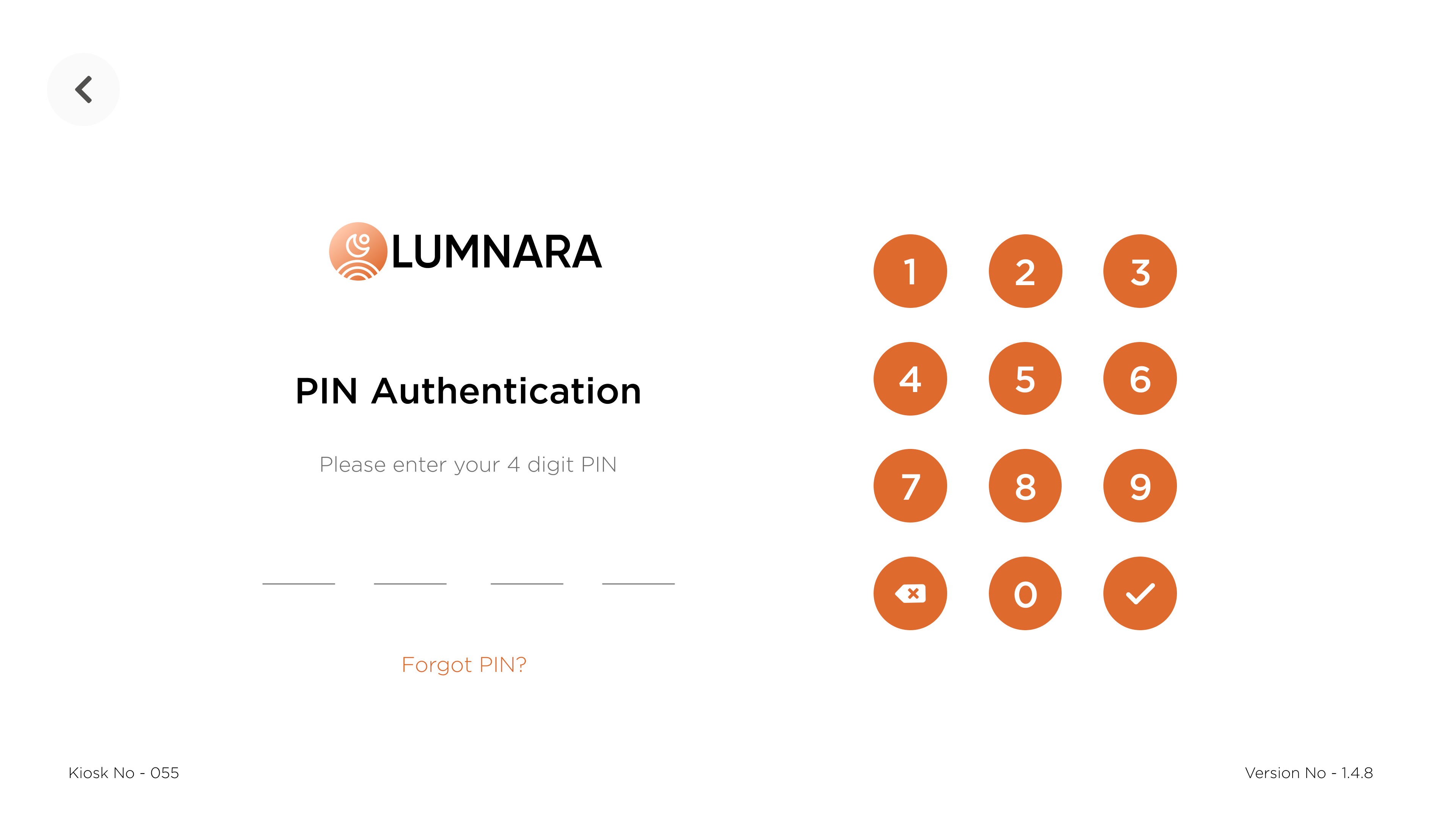
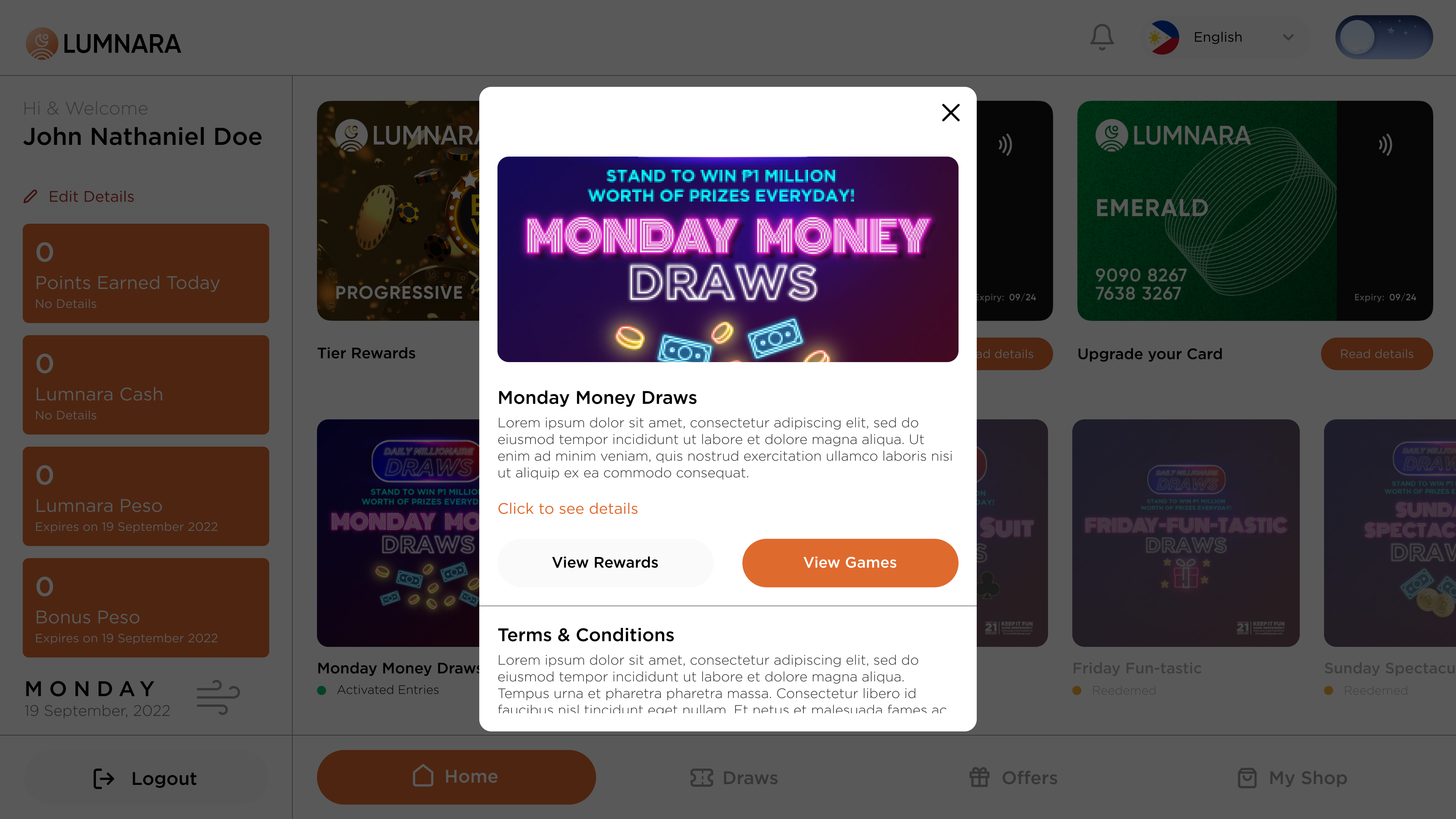
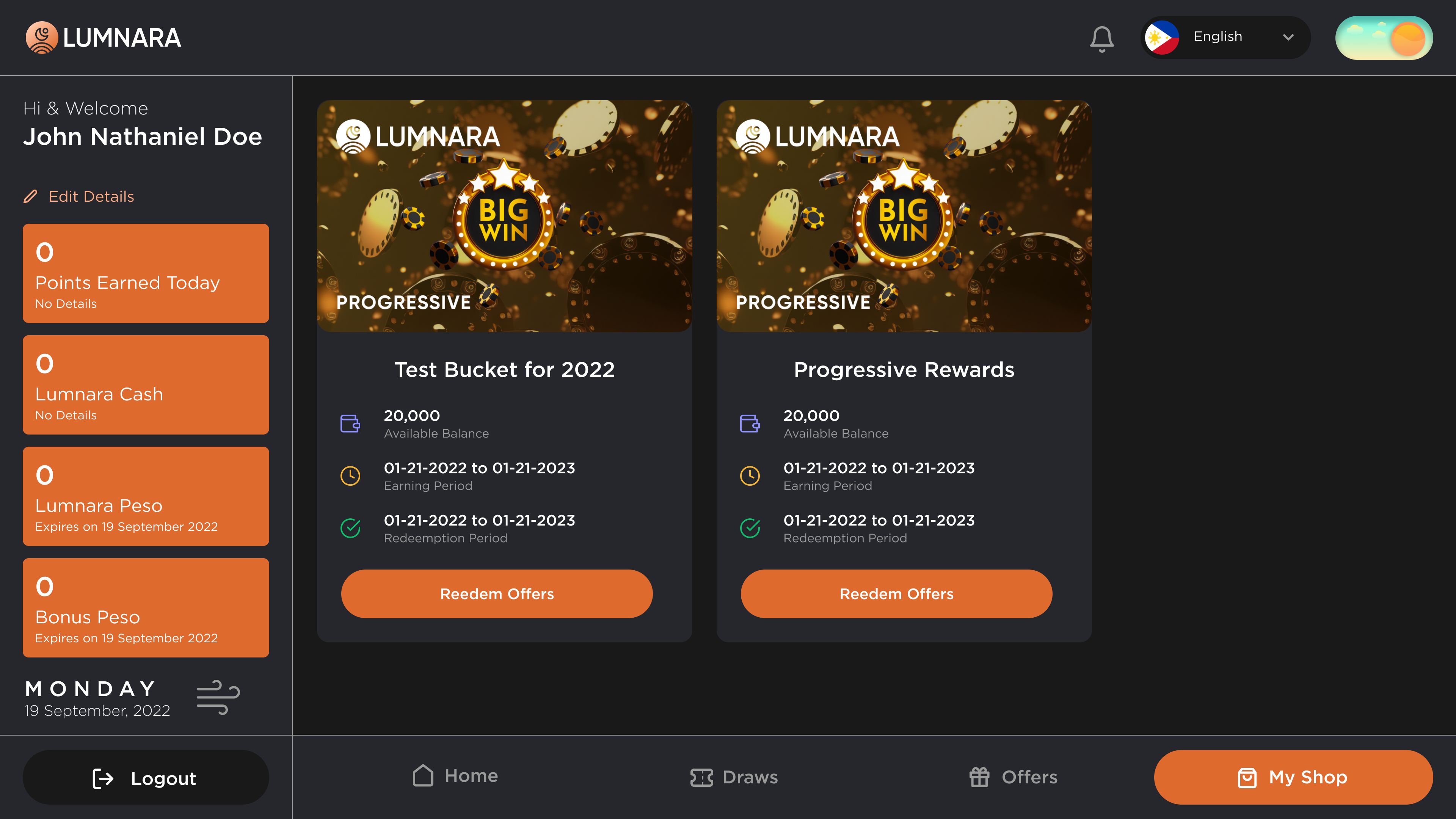
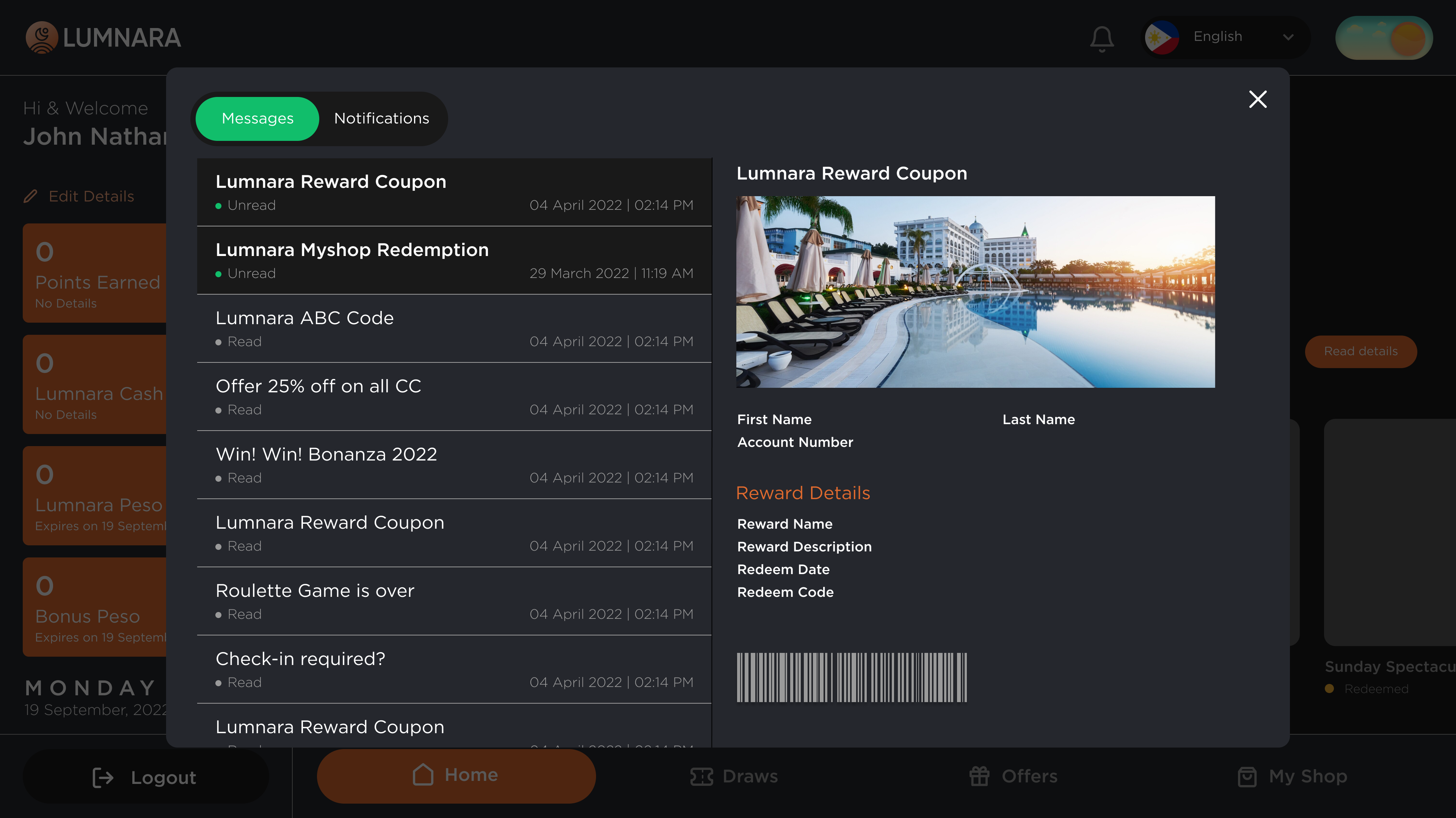
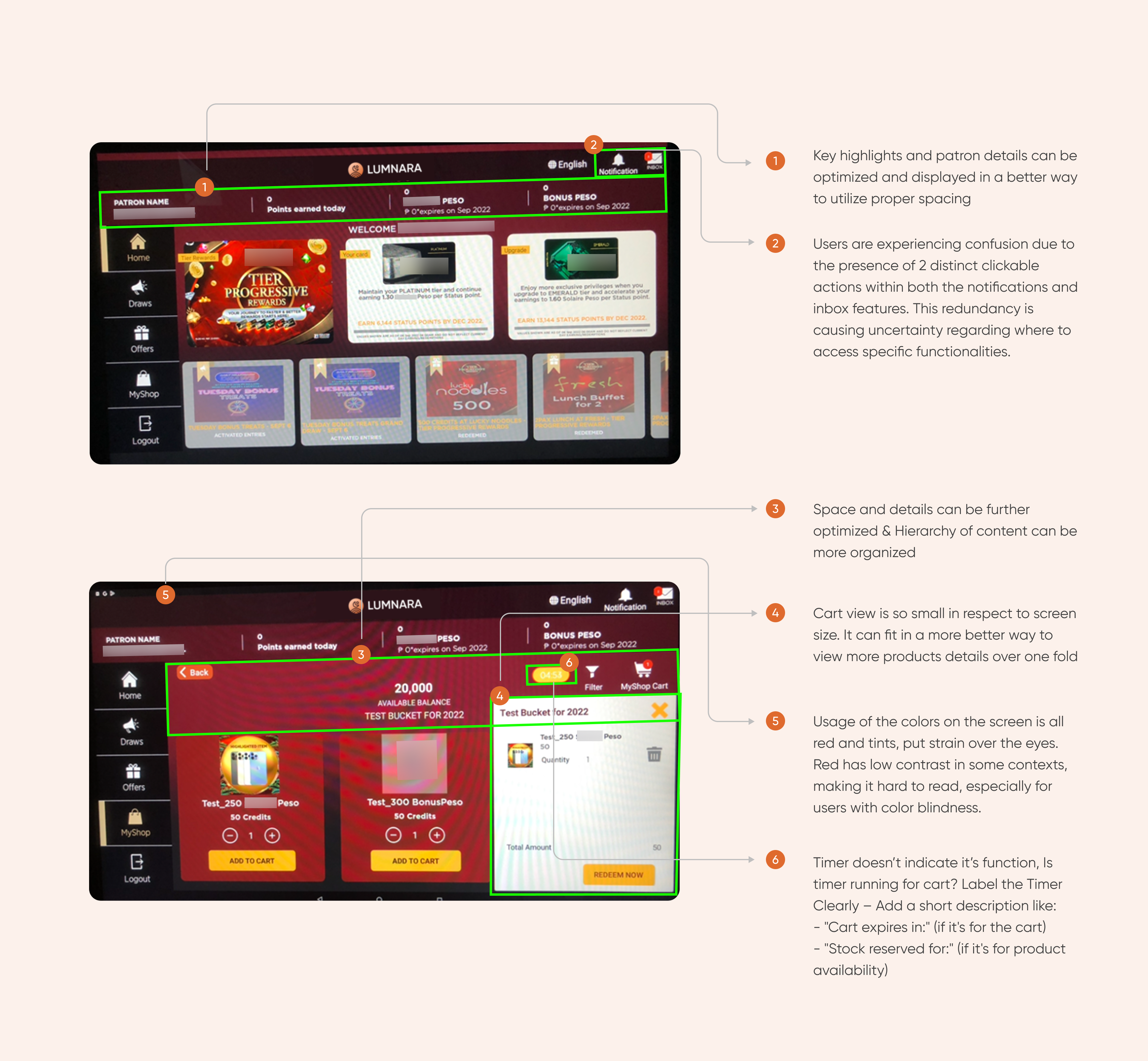
UX Analysis/Audit ( KIOSK )
While conducting a UX analysis or audit, several key points are covered to assess the overall interface and user experience of the system. Like evaluating the visual appeal, consistency, clarity of design elements such as color scheme, typography, icons, buttons and layout. Assess the ease of navigation and discoverability within the system, reviewing the hierarchy of content and features, content presentation, functionality of key features, user feedback and support and to identify areas for improvement and make informed decisions.
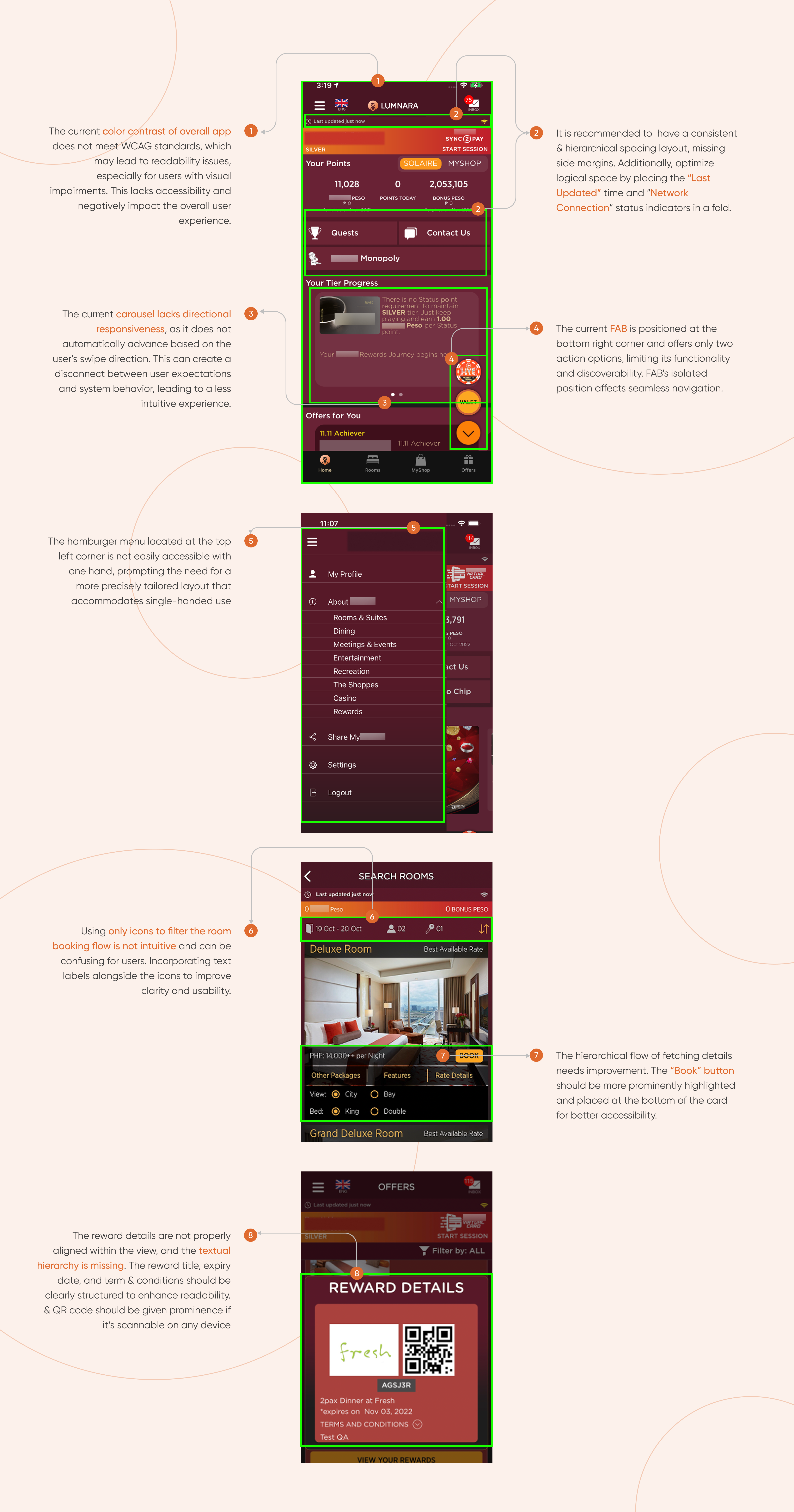
UX Analysis/Audit ( MOBILE )
After workout
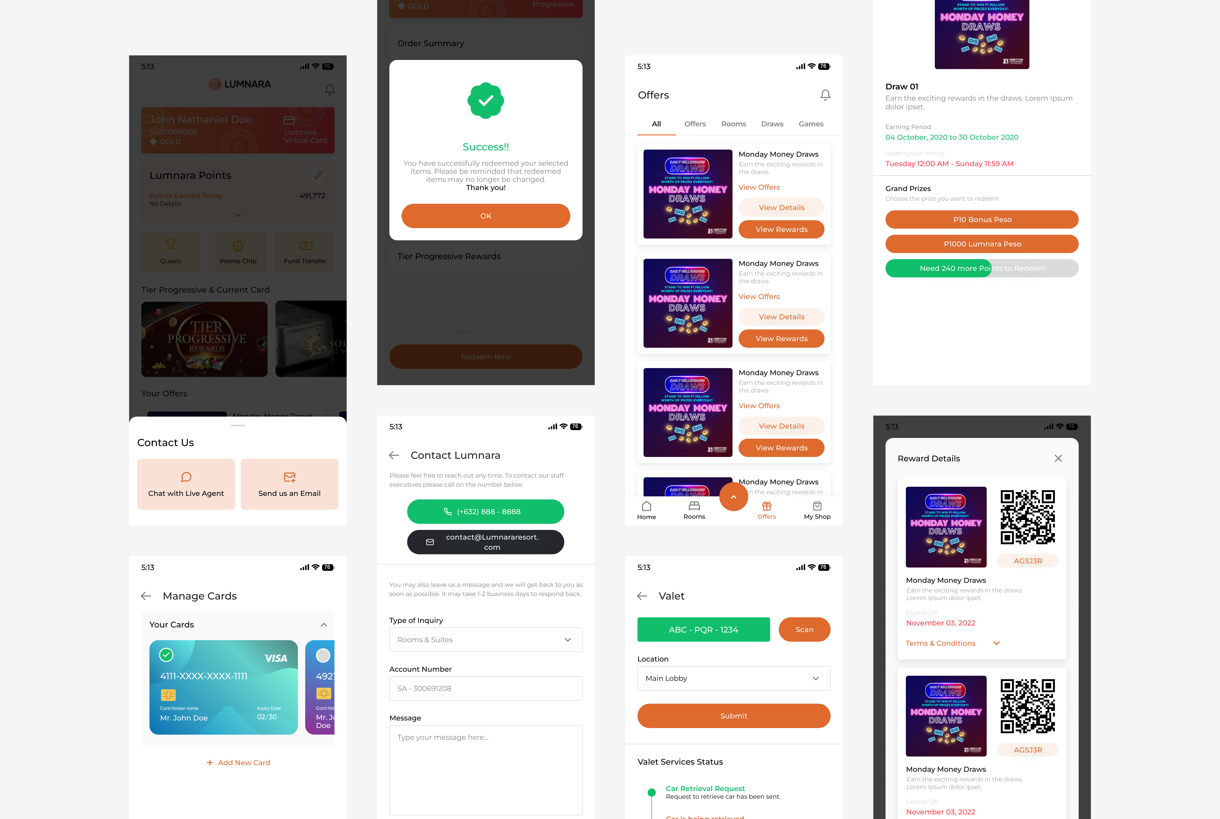
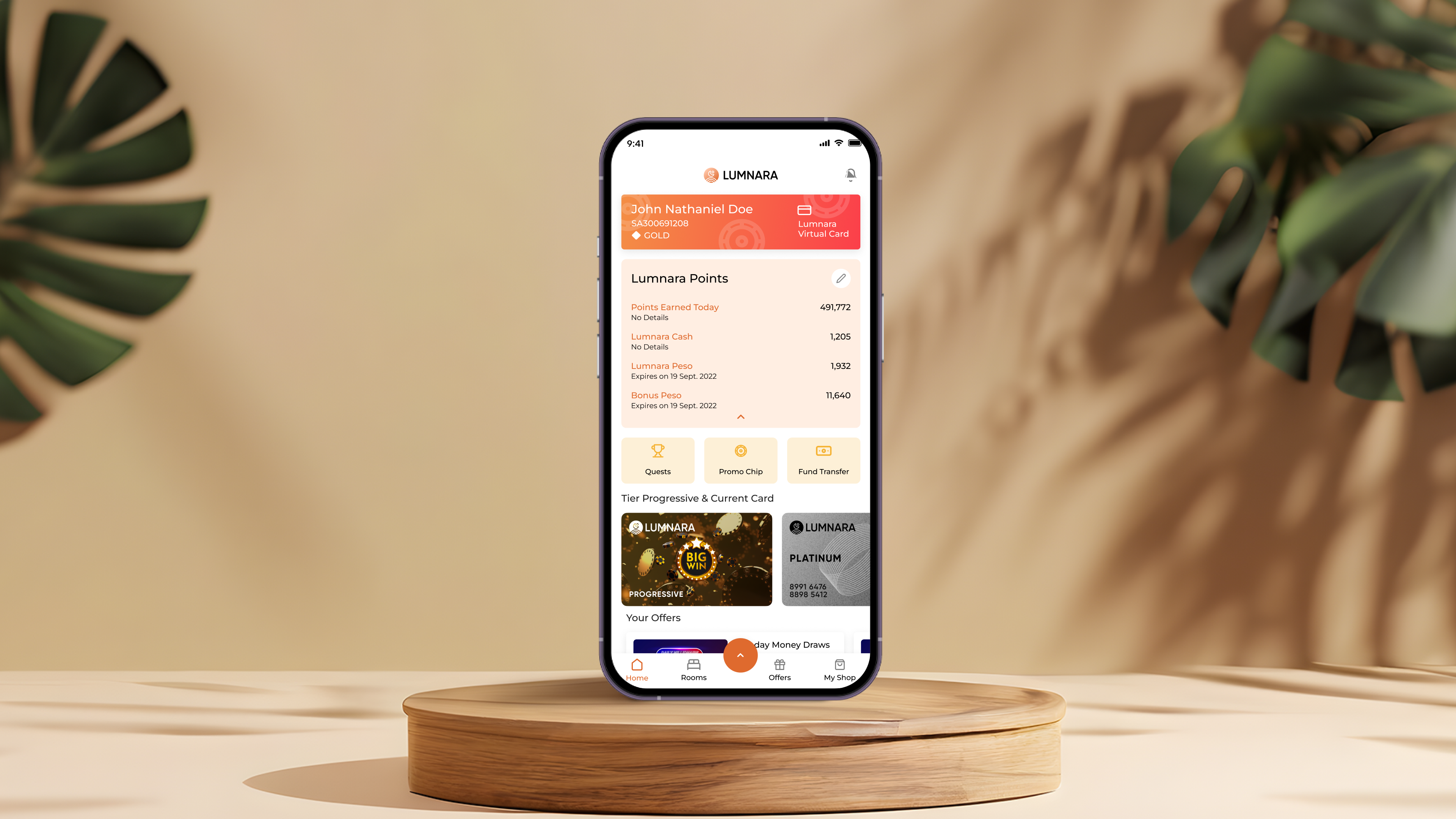
After analyzing all screens based on the UX audits, I've went to solve on some of the key problems with redesigning the interface.

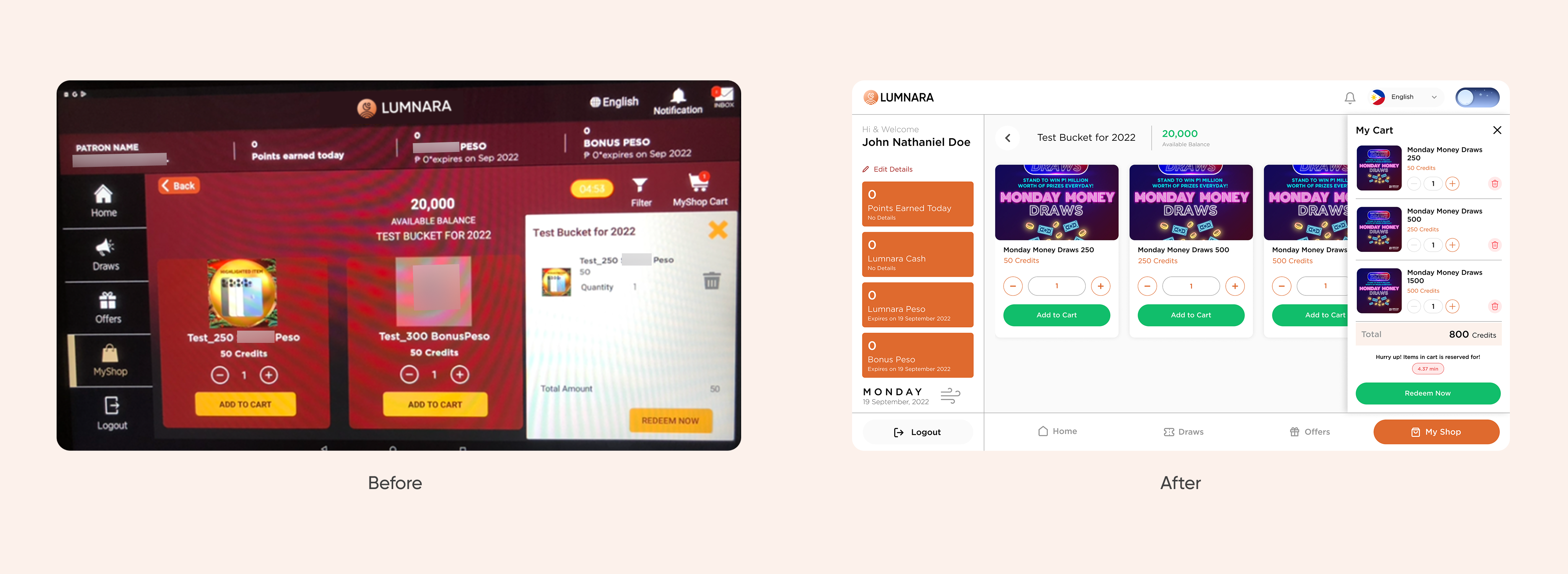
Redesign for mobile