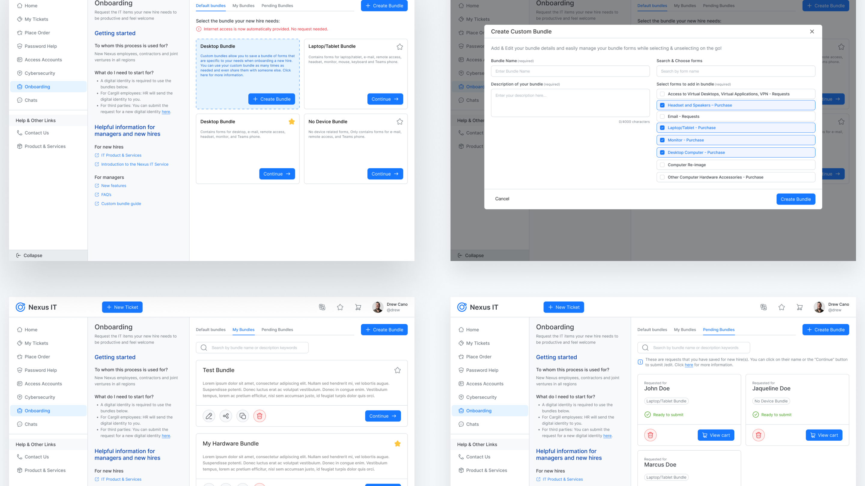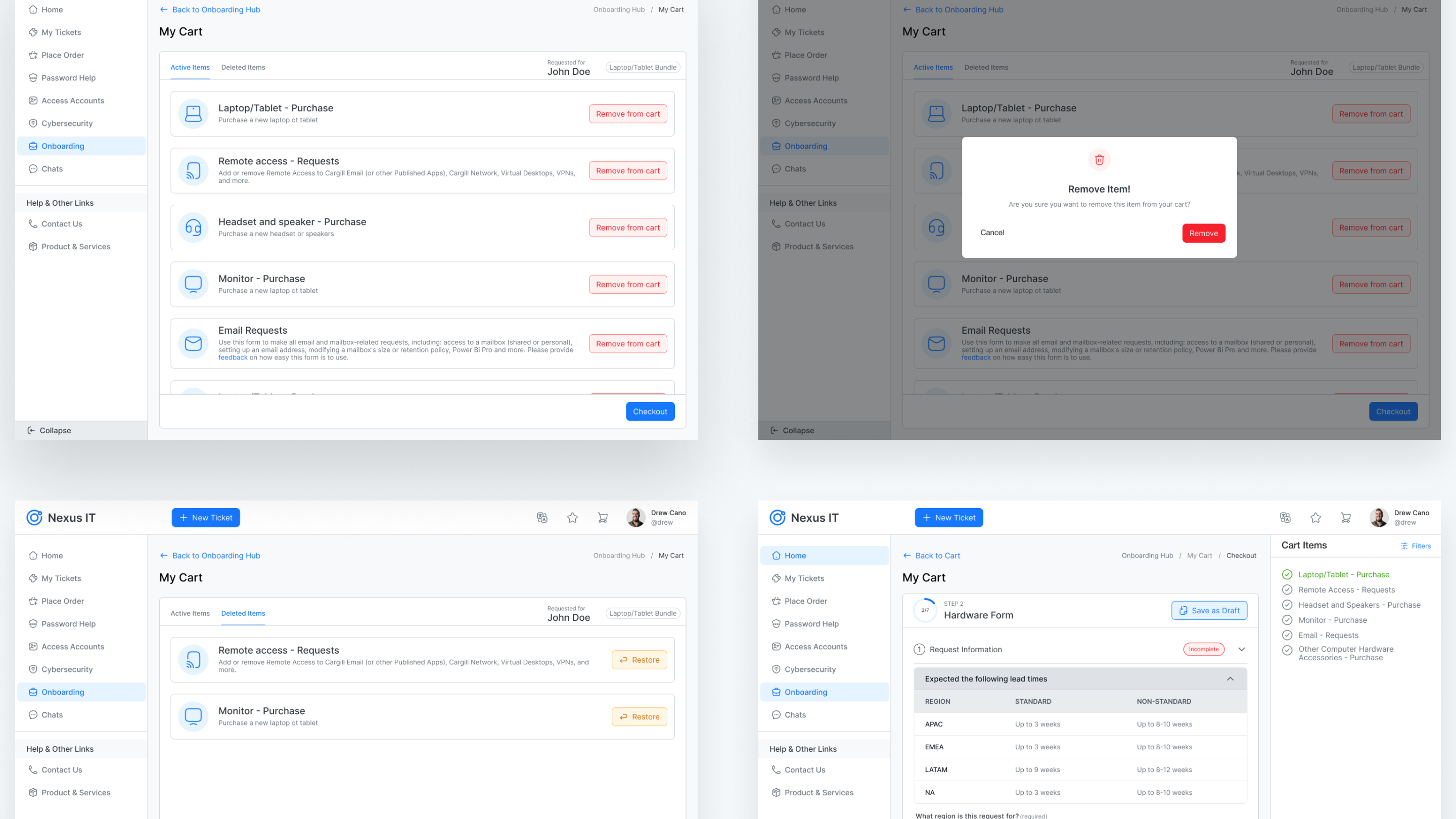
Problem Statement
Nexus IT being a core tool within the organization, product plays a vital role in streamlining workflows and driving efficiency. However, despite its comprehensive feature set, the current user experience and unituitive interface presents challenges that hinder seamless interaction and productivity. Users often face friction in navigating the system, completing tasks efficiently, and accessing essential information. Additionally, the overall interface and workflows do not fully align with user expectations, leading to inefficiencies and increased reliance on support.
The client envisions reshaping its platform to provide a more seamless and user-friendly experience for its daily users, including employees and contractors. The current system presents challenges in enabling users to efficiently interact with IT workflows, search for information, browse resources, complete forms, and manage essential tasks such as onboarding and offboarding. The existing experience lacks the intuitiveness and efficiency needed to support a smooth, frictionless workflow. To address these challenges, the client aims to transform the platform into a more intuitive, efficient, and user-centric solution.
The Solution
Our solution is to reimagine the user experience by bridging the gap between the platform’s potential and its practical usability. We will transform the product into a refined, intuitive, and user-centric platform that seamlessly integrates with daily workflows and empowers users to operate more efficiently. This approach focuses on simplifying navigation, enhancing search functionality, and streamlining form interactions while ensuring better accessibility to key resources. Ultimately, these improvements will reduce operational friction and maximize overall productivity, enabling users to complete their tasks with ease.
My Engagement into seamless UX experience
I was actively involved in conducting extensive user research for the Nexus IT platform redesign. This involved designing and executing structured survey questionnaires targeting a user base to uncover behavioral patterns, pain points, and usability challenges. We established a System Usability Scale (SUS) framework to quantitatively assess the platform’s usability, enabling us to benchmark and prioritize key issues. Through deep analysis of survey responses and SUS results, We distilled actionable insights that pinpointed specific areas of friction—particularly around navigation, workflow efficiency, and user satisfaction. These findings directly informed our user-centric design strategy and laid the foundation for impactful experience improvements.

Uncovering User Needs Through Insight-Driven Research
To redesign Nexus IT, we surveyed 790 users to uncover real pain points, usability barriers, and standout features. Through structured survey questionnaire, Interviews and System Usability Scale (SUS) scoring, we identified core issues in navigation, ticket submission process, Ticket status, and visual clarity. These insights shaped a user-centered redesign strategy—balancing functional improvements with delightful UX—to transform frustration into seamless, intuitive engagement.


Overall SUS Score: 57.2 (Indicates room for improvement)
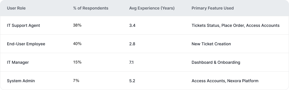
Table: User Persona Coverage (Demographics from survey)
Survey Results
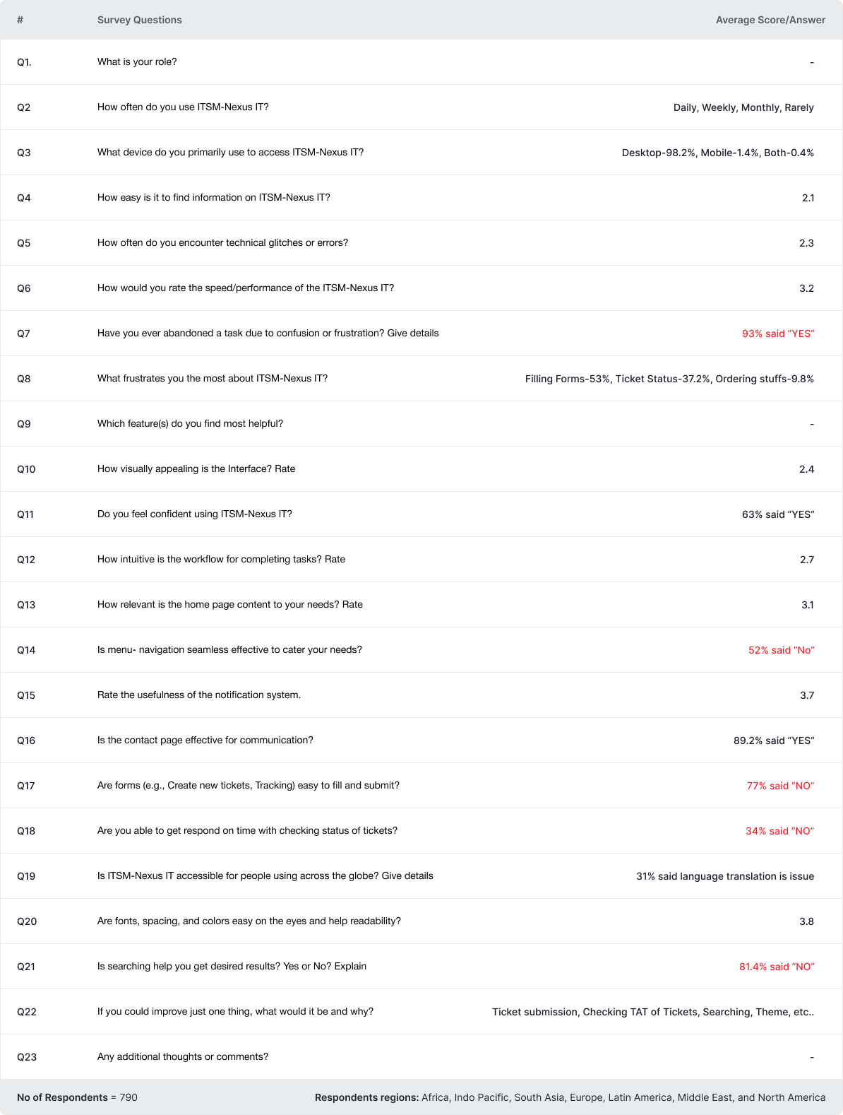
Survey Quesionnaire & Responses
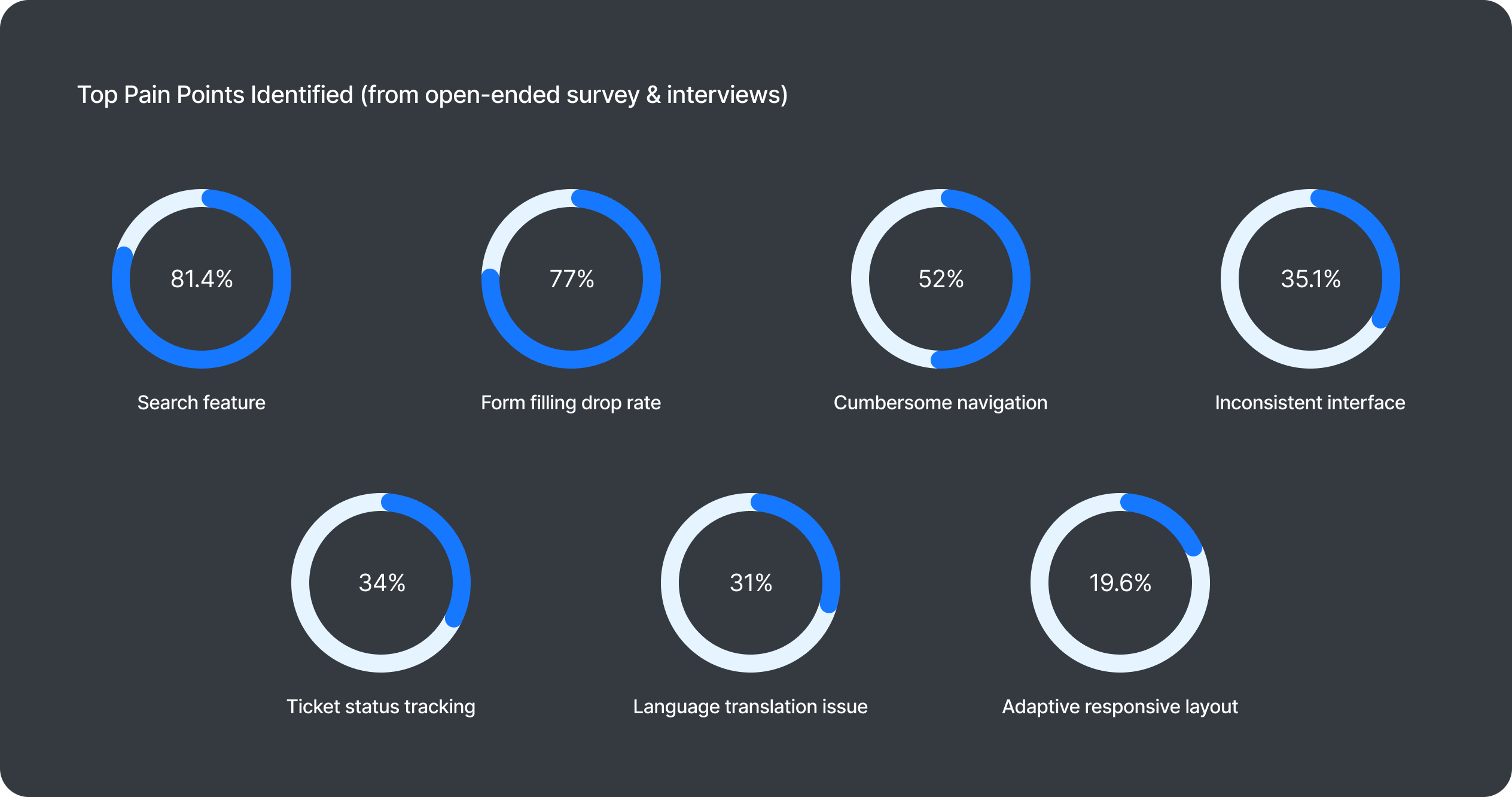
Key insights from user research
77%
of users encounter frustration when the submit button remains inactive after completing enlogated form fields on the ”My Tickets” screen
81%
Users faces challenges locating the correct forms and links using the search bar, resulting in choosing the ”Submit a new Ticket” button which will eventually raise a general ticket.
34%
Users struggles to identify the ticket status and to whom it has been assigned to on the go within complex tabular flow.
52%
Users reported difficulty navigating through Nexus IT, citing a cumbersome navigation structure that requires frequent back-and-forth clicks to return to the homepage or to desired page.
Key Solutions to Nexus IT
😥 Pain Point
The previous interface incorporated a top double-header navigation, where selecting a menu option would reload desired page and navigation disappears from that page. So discoverability of these navigation menu seems to have become obscured, requiring user to resort to the browser’s back function to navigate back to access the navigations again.
🫡 Solution
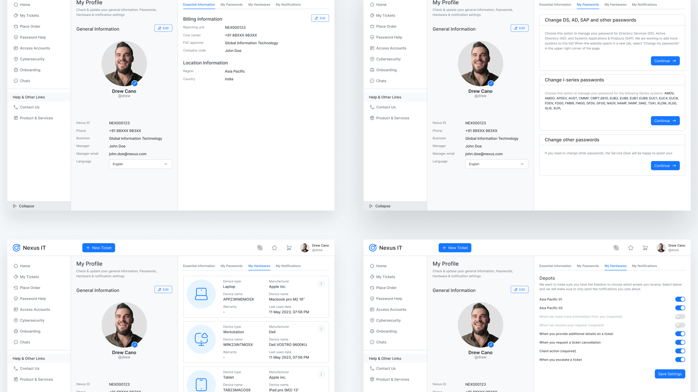
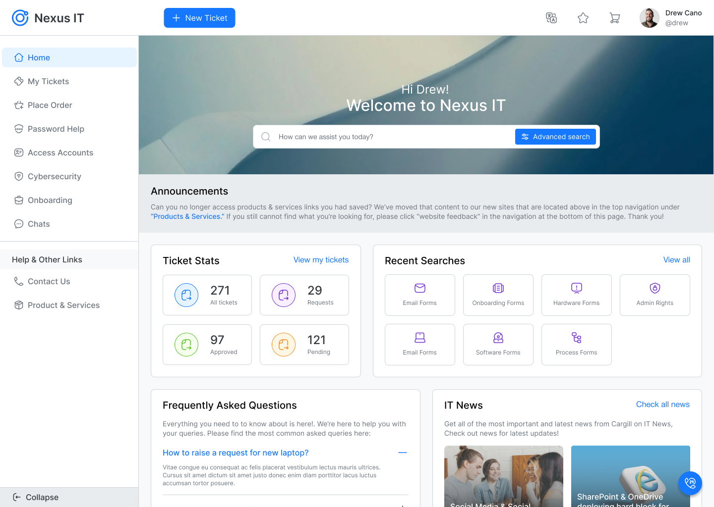
To address the above challenge we adopted strategic transition from conventional top double-header navigation to a left-side pane navigation menu. This deliberate shift ensures the navigation menus are consitently displayed and readily accessible, positioned prominently within the interface.
😥 Pain Point
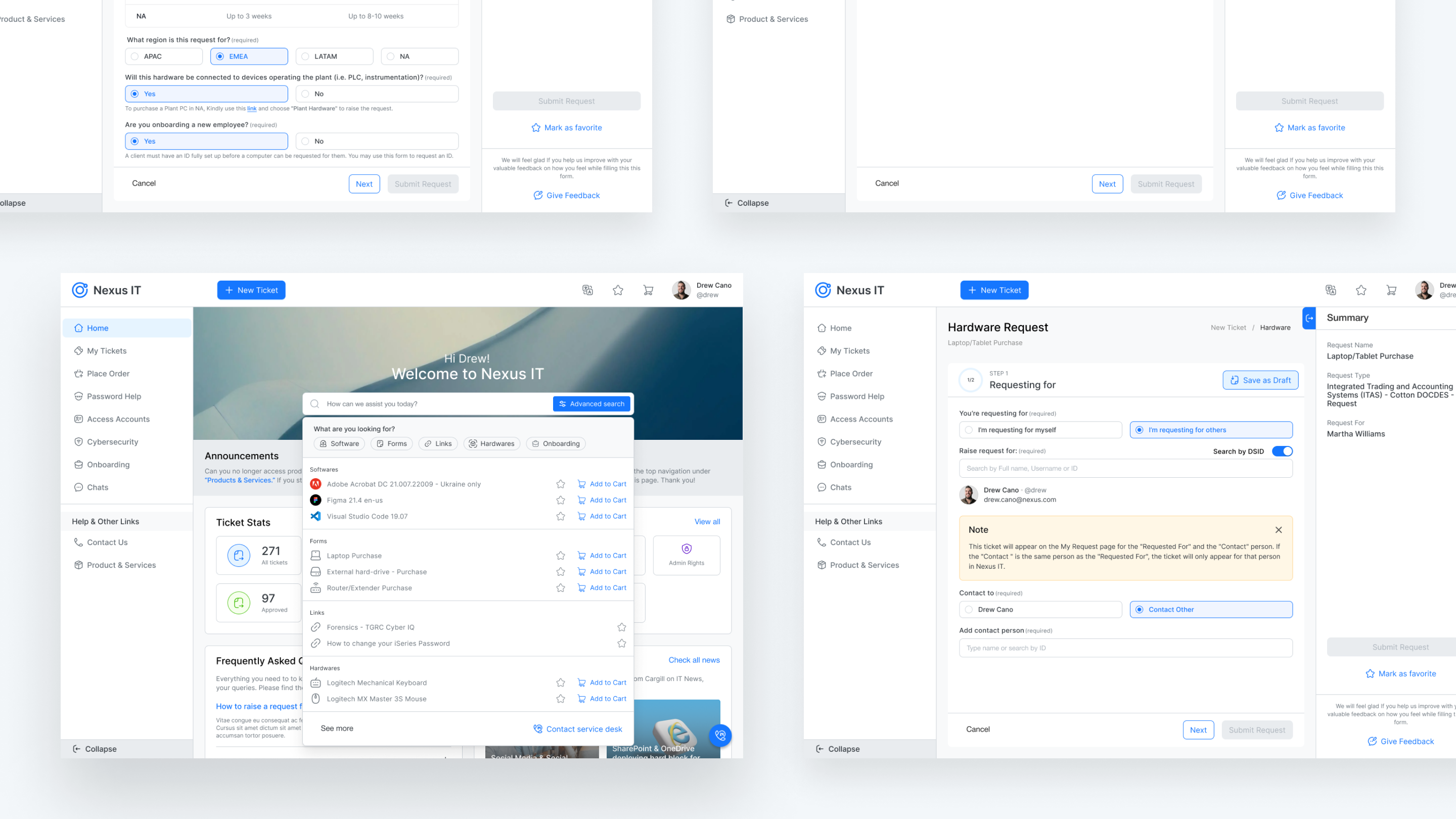
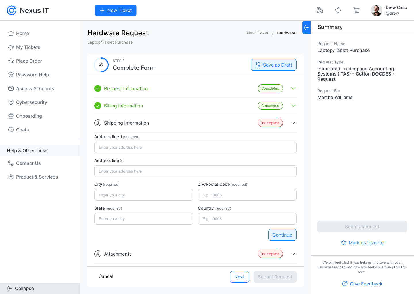
In the application ”My Tickets” screen or the form layouts, we've identified a significant usability challenge. According to the insights users find it difficult to guage thier progress within the form and encounter confusion regarding completed versus pending sections. This lack of clear indicators on the completion status and required fields leads to uncertainty, especially when new questions dynamically appear based on prior responses. As a result users struggle to discern which questions they've yet to address.
🫡 Solution
To enhance the UX, our focus was to implement the more intuitive layout. We introduced the clear sections split-ups into accordion view with title headers and introduced the visible cues like chips/badges that visibilty display the incomplete, complete, optional and current status on the sections and every form field will highlight when it remain unfilled before jumping over to next section. This helps users to easily identify and understand the unfilled or missed part in the forms and easy to address thatwithout cognitive load.
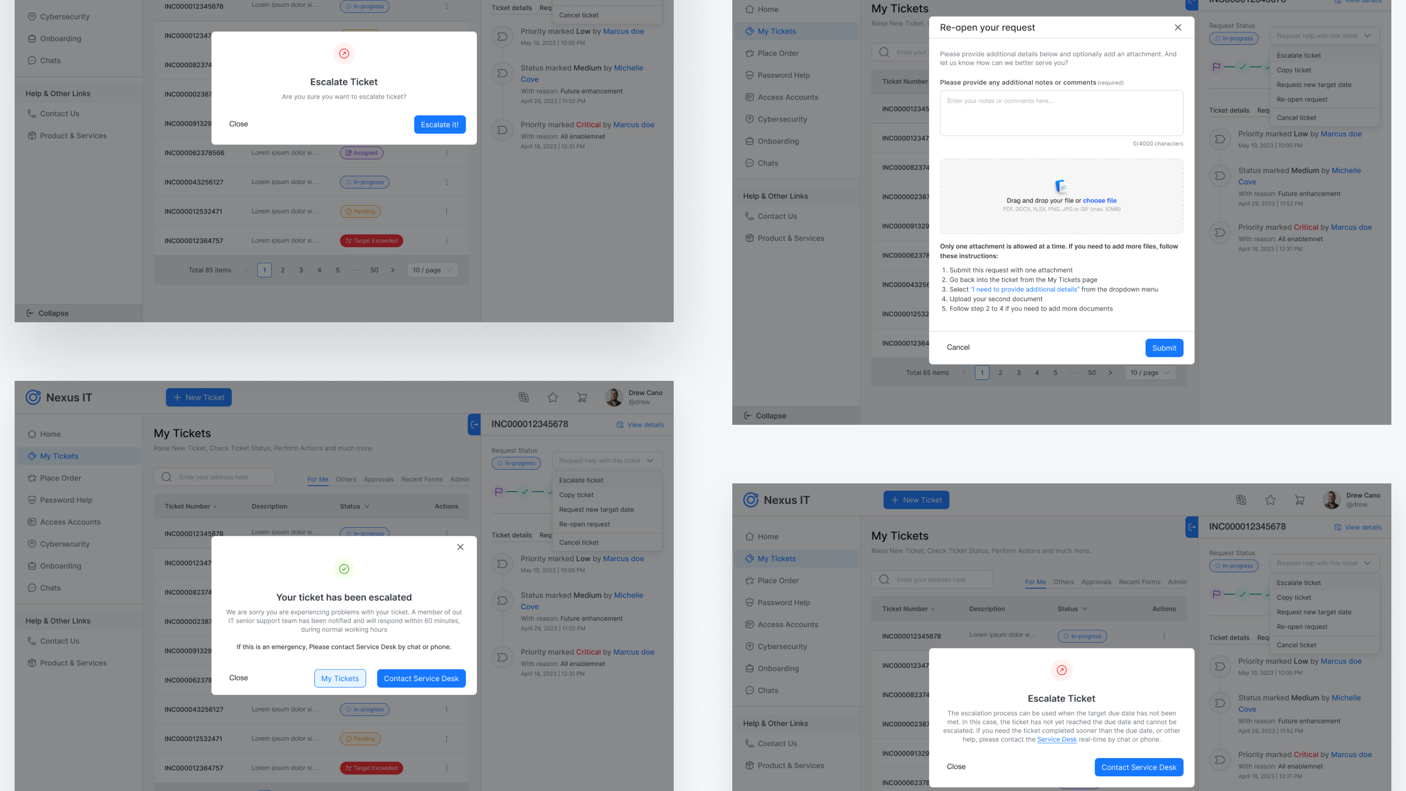
😥 Pain Point
The existing application design poses a user experience challenge wherein users are required to navigate to the ”My Tickets” section, and subsequently, click on individual rows to access detailed information of the intended ticket ID, such as description, Requested for, Status, Targeted Date, Assigned to, Approval Details, Request Details, Notes, Designated Team, etc.. This design necessitates a substantial number of back-n-forth clicks to perform and retrieve the desired results. This inefficiency undermines user satisfaction and overall usability of the application.
🫡 Solution
The UX enhancement of ”My Tickets” involves an intuitive layout, introducing a quick-view feature for selected rows in the ”My Tickets” screen. Additionally, tabs are introduced for sorting data based on categories such as ”For me”, ”Others”, ”Approvals”, ”Admin”. When a user selects a row from the table, a detailed information quick view (right pane) is displayed, enabling users to efficiently review data and perform actions as needed. This approach facilitates seamless navigation between multiple rows and glance of its information with single-click interactions.

😥 Pain Point
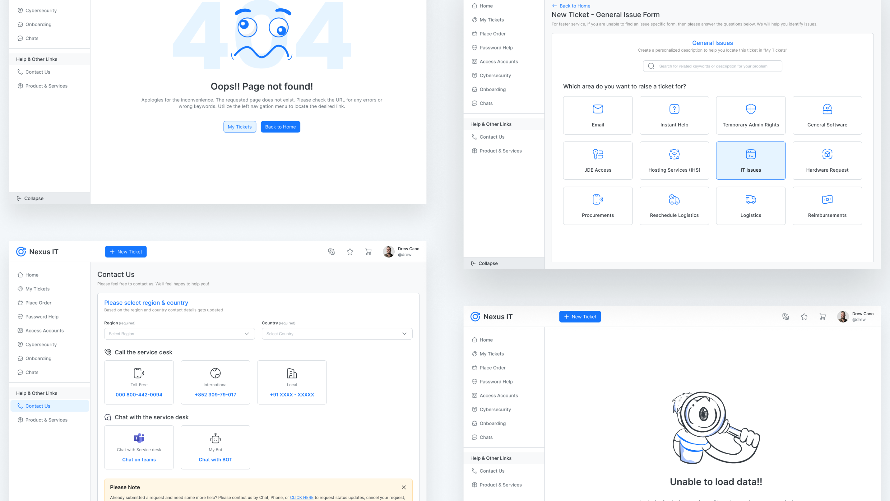
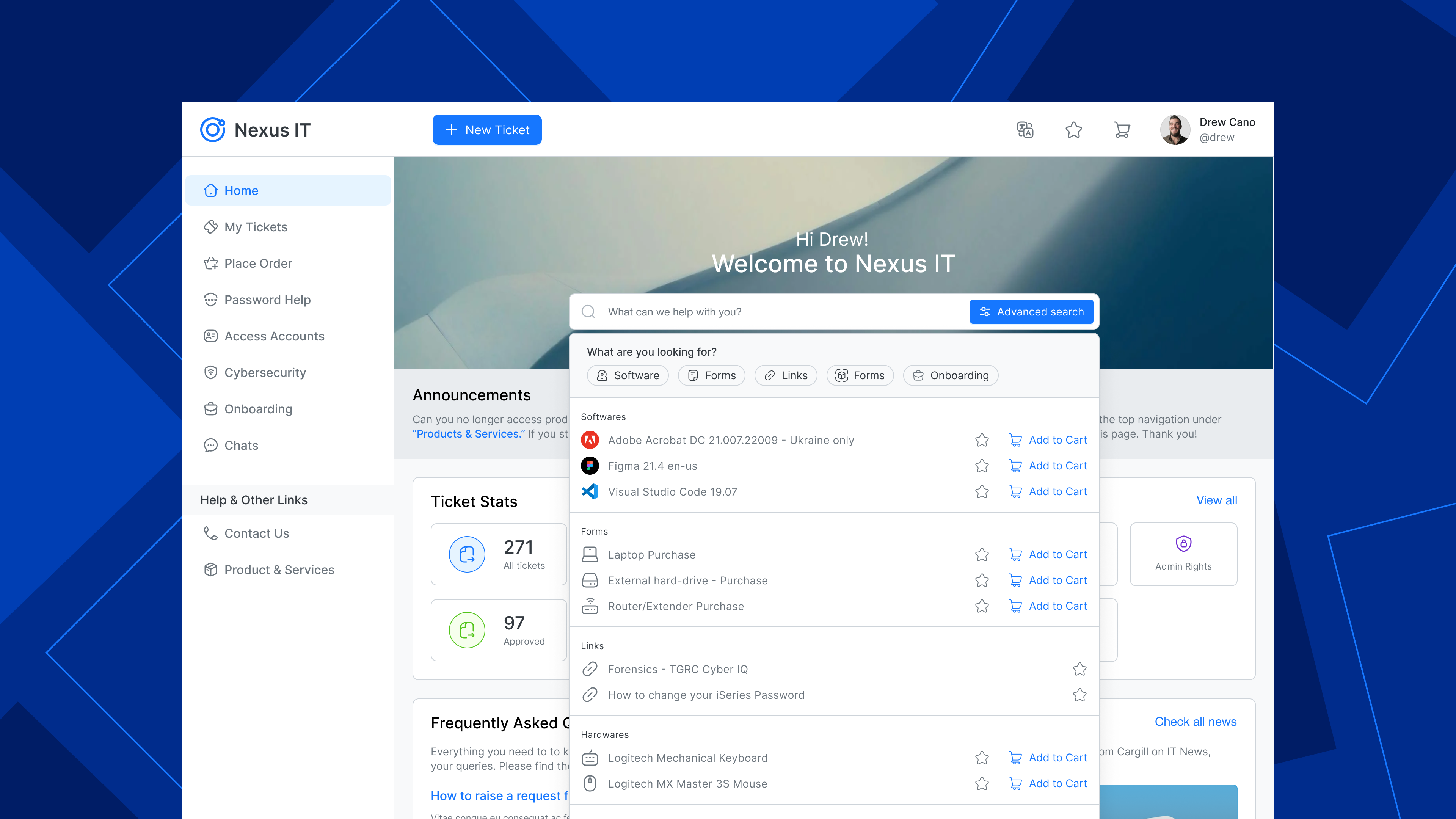
The existing UI lacks an advanced search feature for refining product searches within the search listings. The absence of specific filters in general search bar results in a suboptimal experience, making it challenging for users to efficiently locate their desired results. The lack of filtration option hinders the precision and customization of search results.
🫡 Solution
To address the deficiency in the old UI's search functionality, The proposed UX solution is to implement an advanced search feature. This search feature incorporate specific filters, allowing users to refine their product listings based on relevant parameters such as based on service category (Business, Productivity, Business Intelligence, Security, Collaboration, Utility) & Publishers. The enhanced UX will provide more tailored and accurate desired results. By offering a comprehensive set of filters aims to provide greater control and empower users on product discovery journey.