Problem Statement
Windows, despite being one of the most widely used operating systems, suffers from UI
inconsistencies across different parts of the system. Legacy and WIN32 UI elements coexist with
modern Fluent Design components, leading to confusion and a disjointed experience for users.
This inconsistency impacts usability, accessibility, and brand perception.
Objective
-
Identify key areas where UI inconsistencies exist in Windows.
-
Analyze their impact on user experience.
-
Propose a structured approach to resolve these inconsistencies.
Research & Analysis
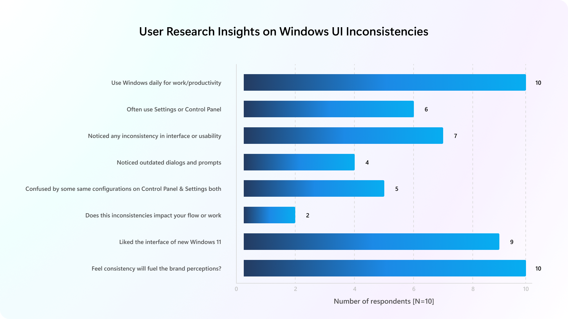
To address the UI inconsistencies within the Microsoft Windows operating system, I've conducted
a multi-pronged research approach combining user feedback collection using 1:1 interviews,
usability and UX evaluations, and competitive analysis with competing platforms. This phase was
crucial in uncovering pain points that hindered user experience and productivity in the Windows
environment.
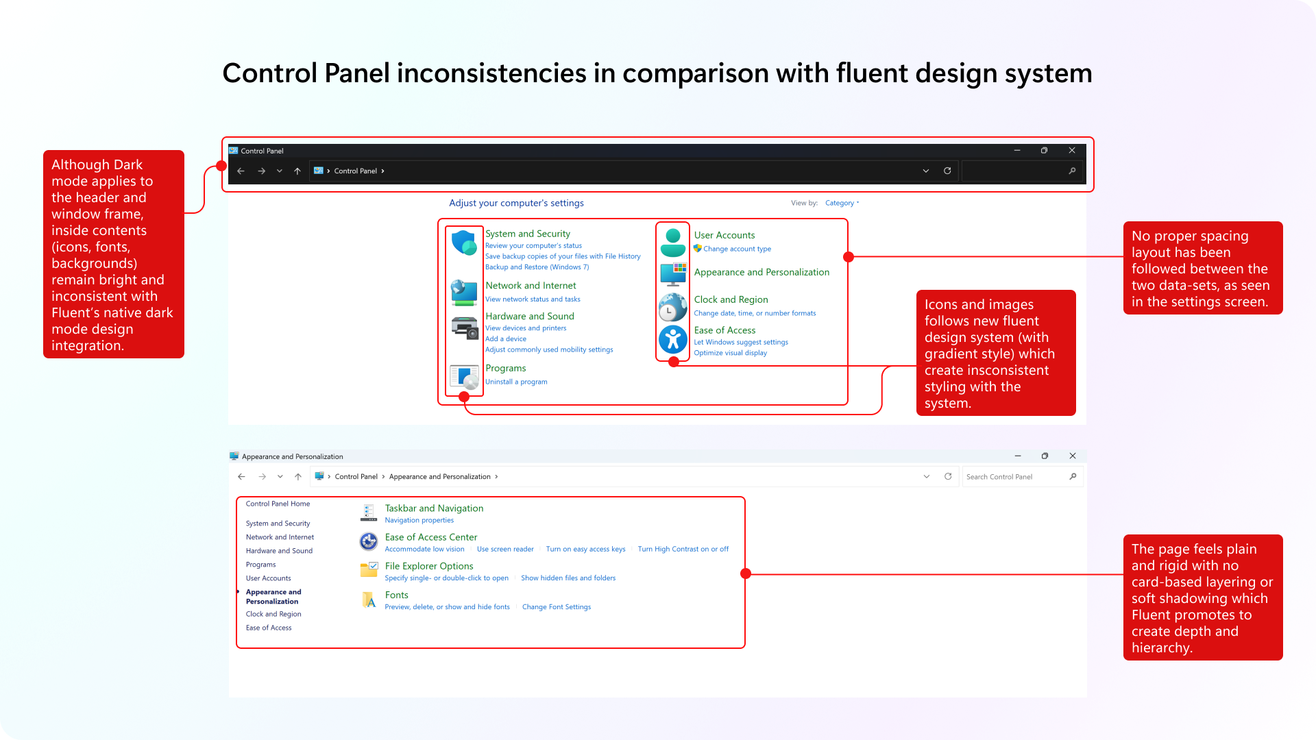
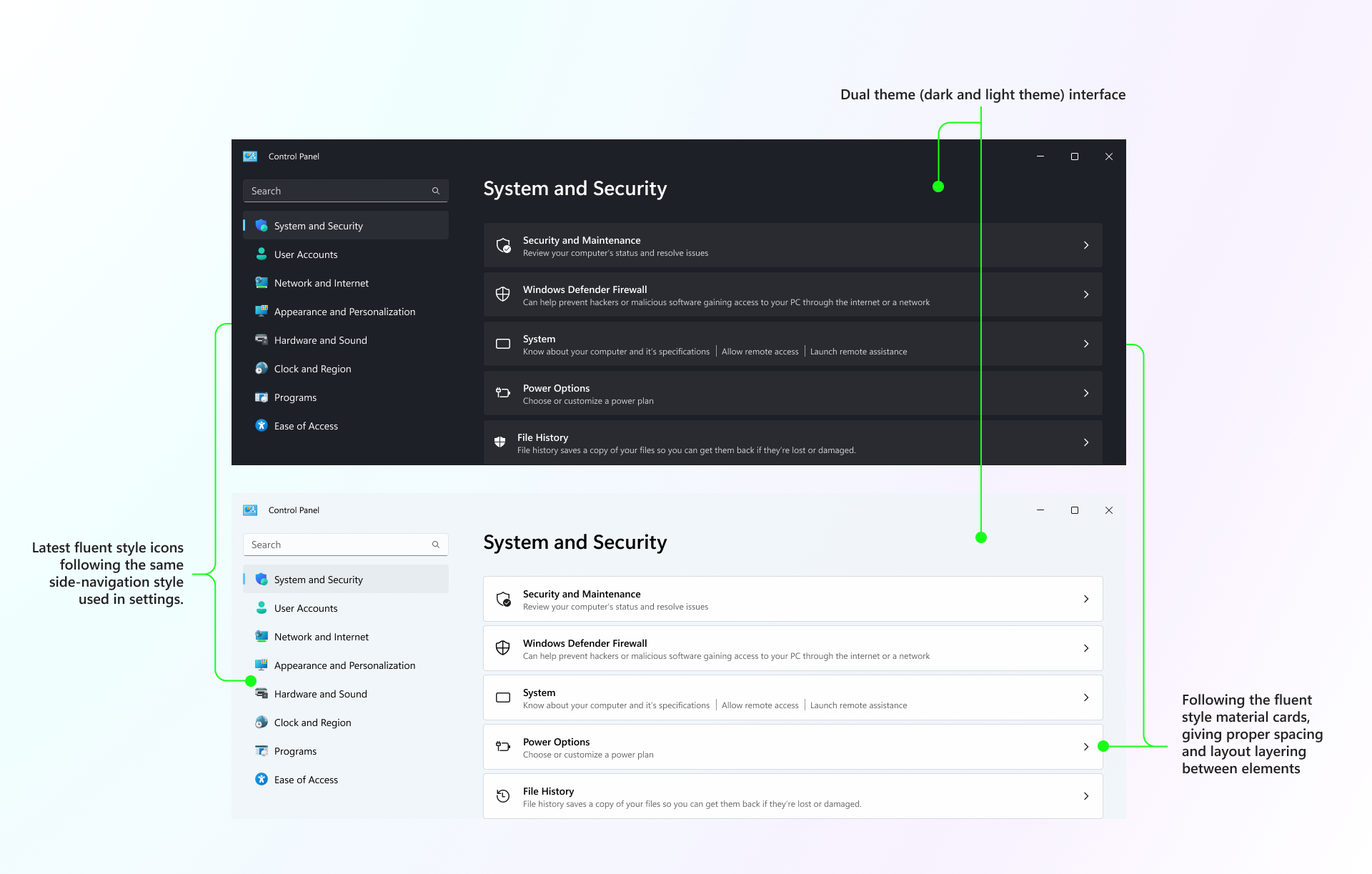
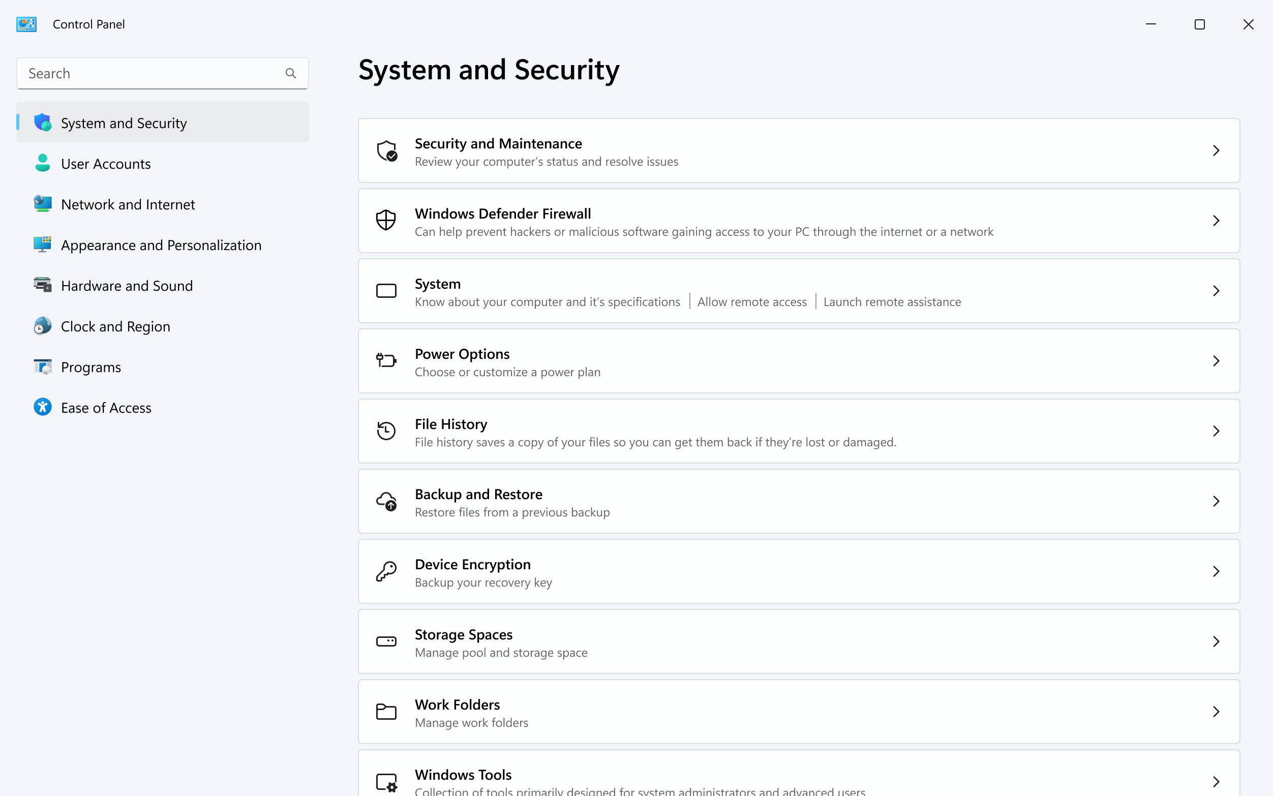
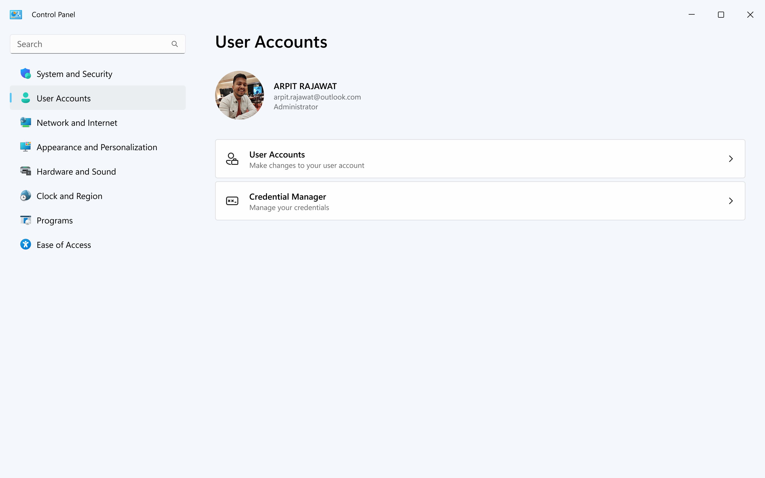
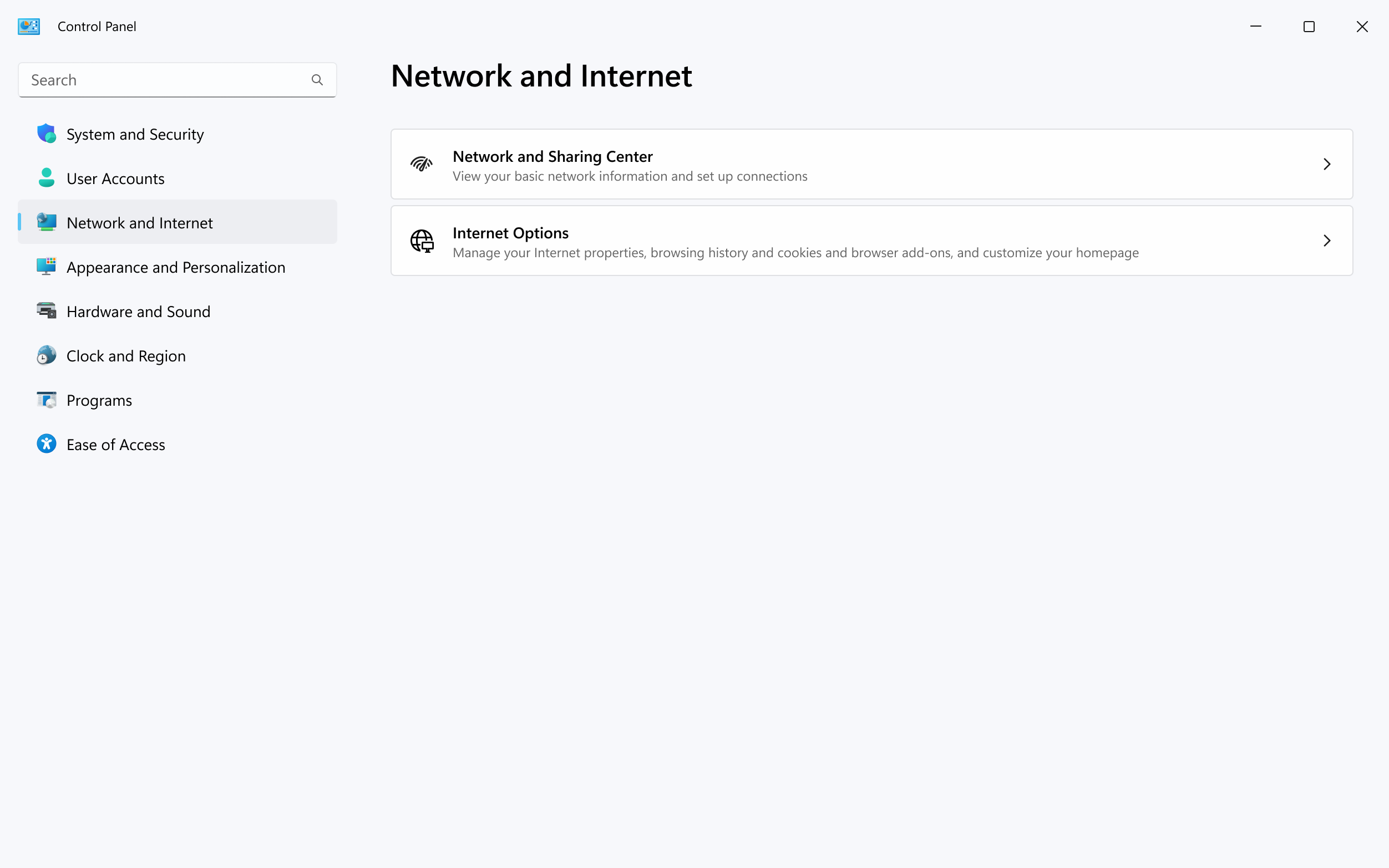
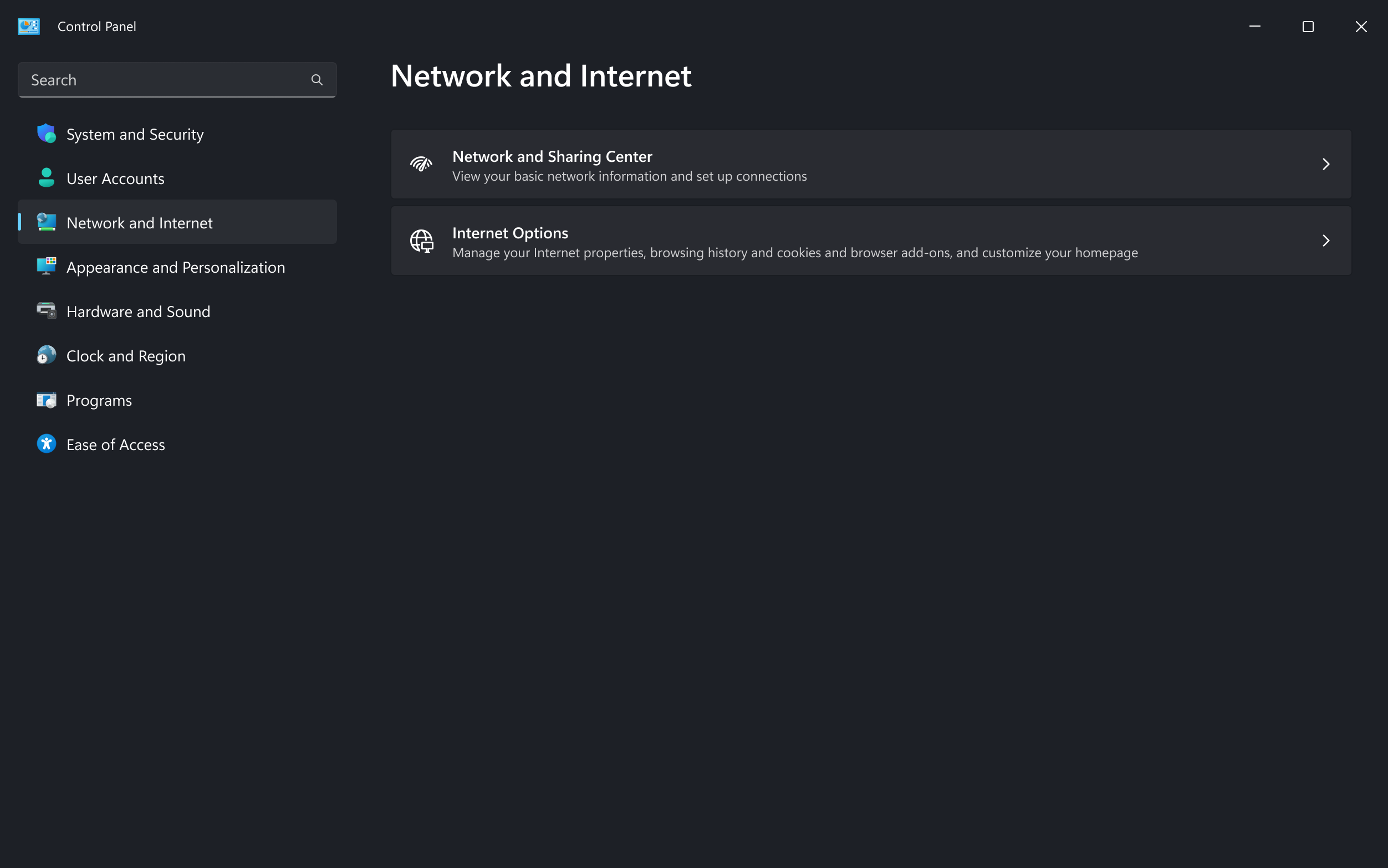
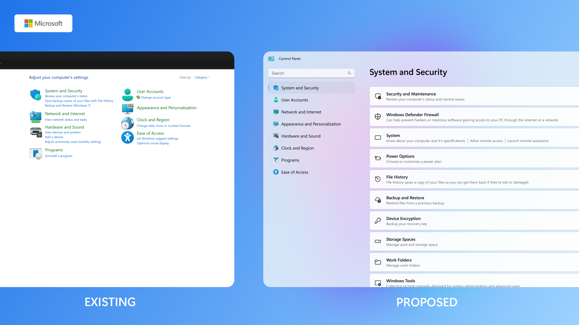
😥 Control Panel vs Settings
-
Duplicate features –
Common settings like Display,
Network, and System Preferences are available in both the Control Panel and
Settings app, sometimes cause confusion about where to go (search for).
-
Missing Feature Parity (in Settings) –
Some advanced
tools (e.g., Advanced device settings, System restore) are only available in
Control Panel, making the Settings app feel incomplete.
-
Outdated UI Interface –
The Control Panel still uses
legacy visuals layouts from older Windows versions, which contrast sharply with
Fluent UI in Settings.
-
Disjointed task flows –
Some tasks started in Settings
redirect users to Control Panel or Prompt modals in legacy style, disrupting the
user journey and trust in the UI consistency.
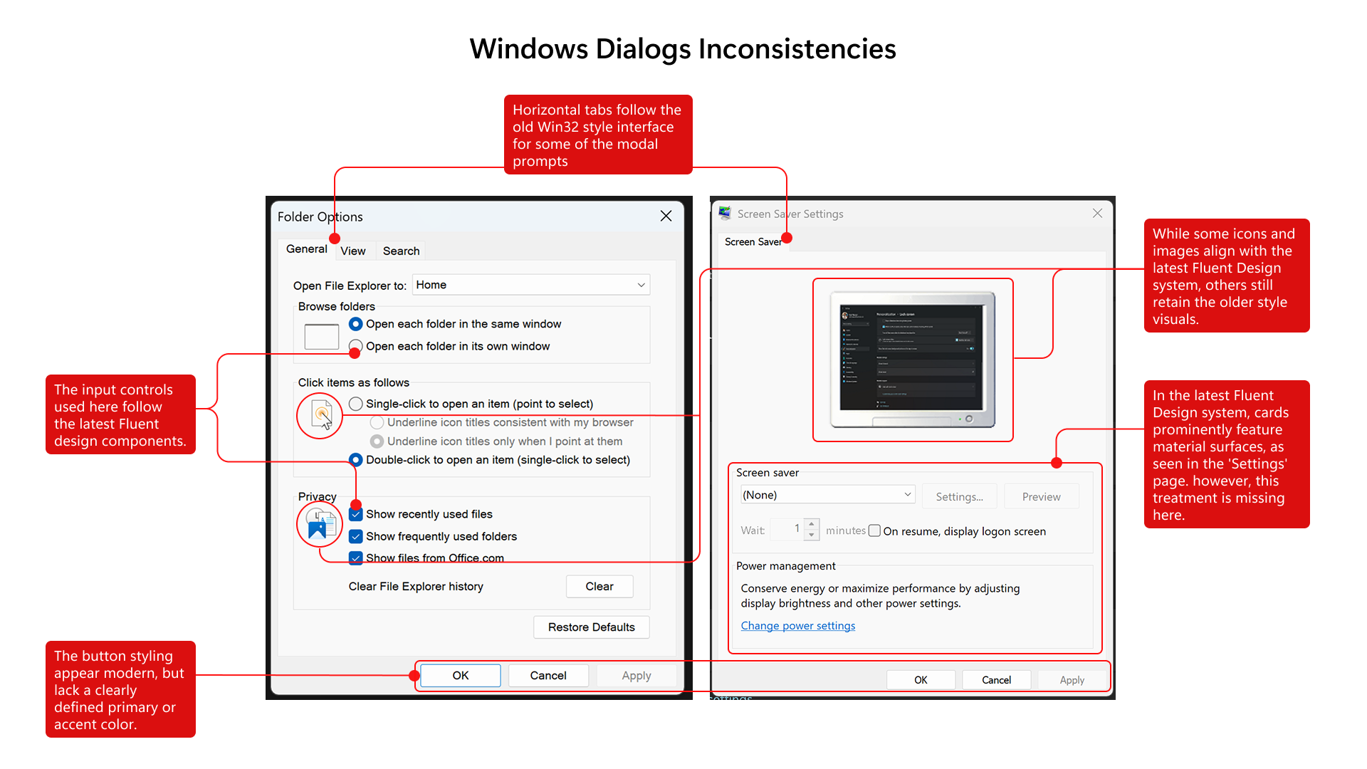
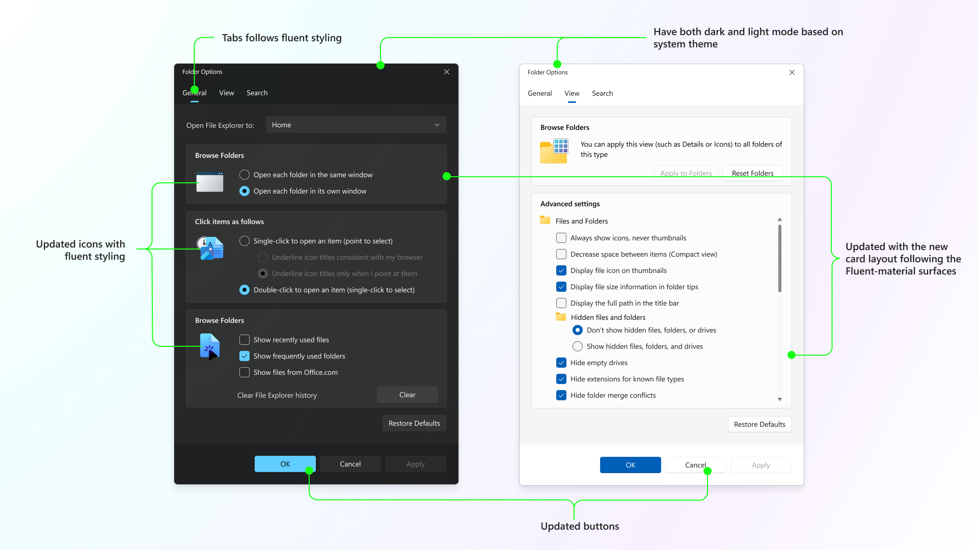
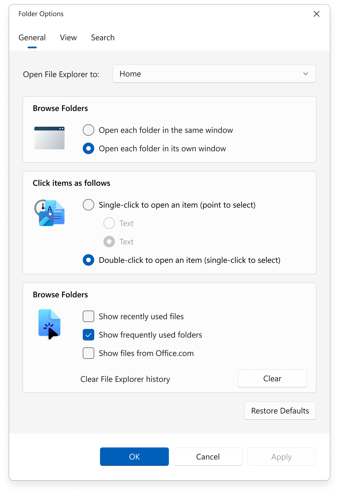
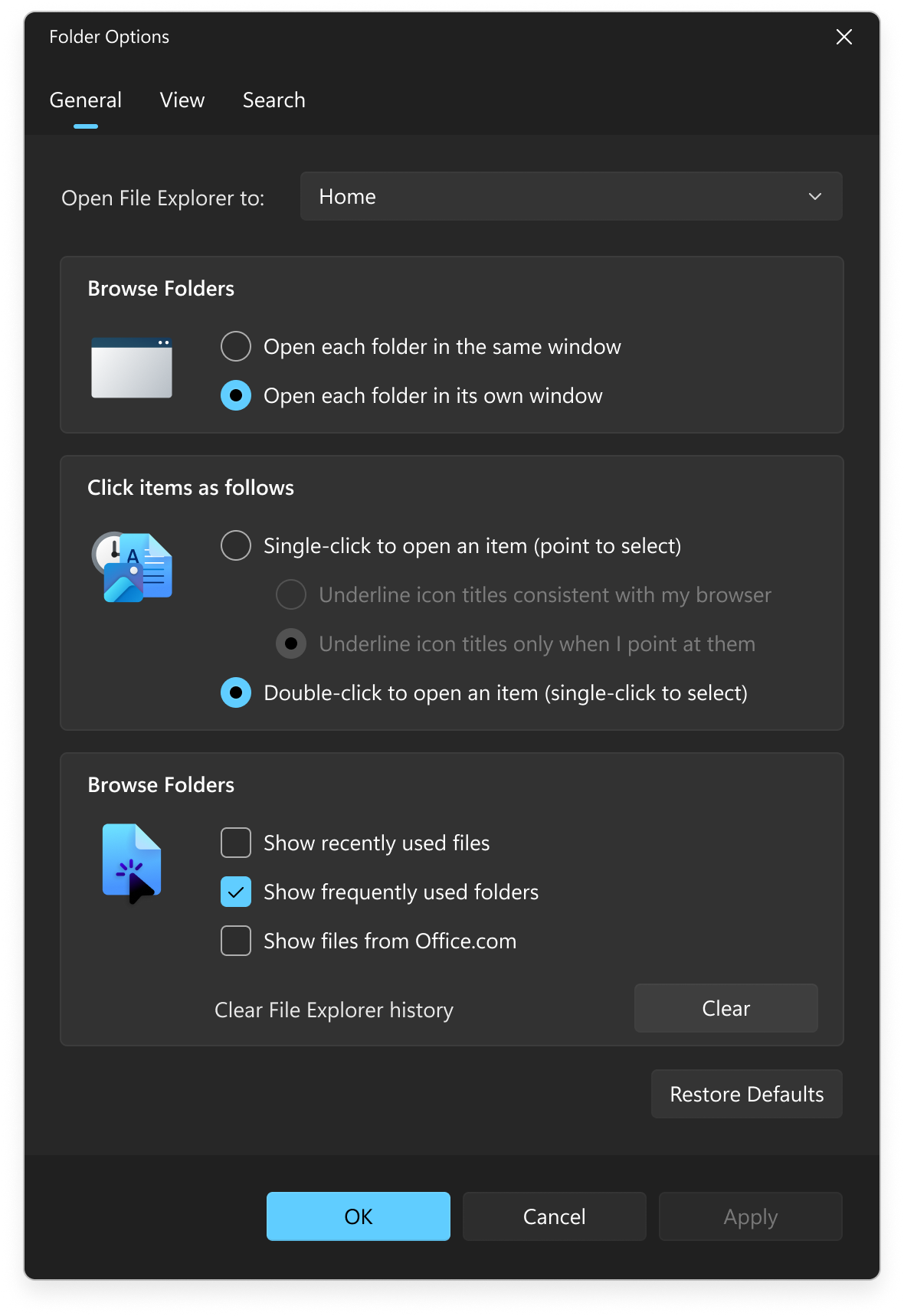
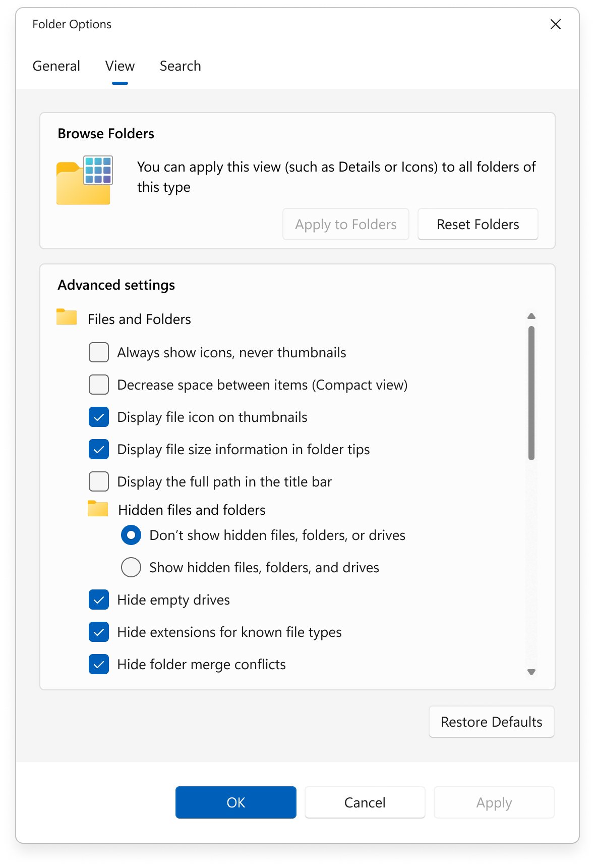
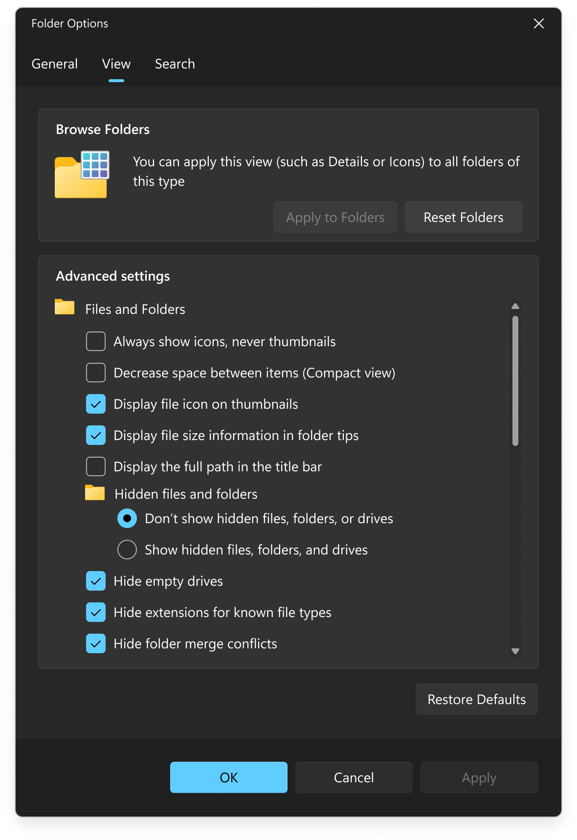
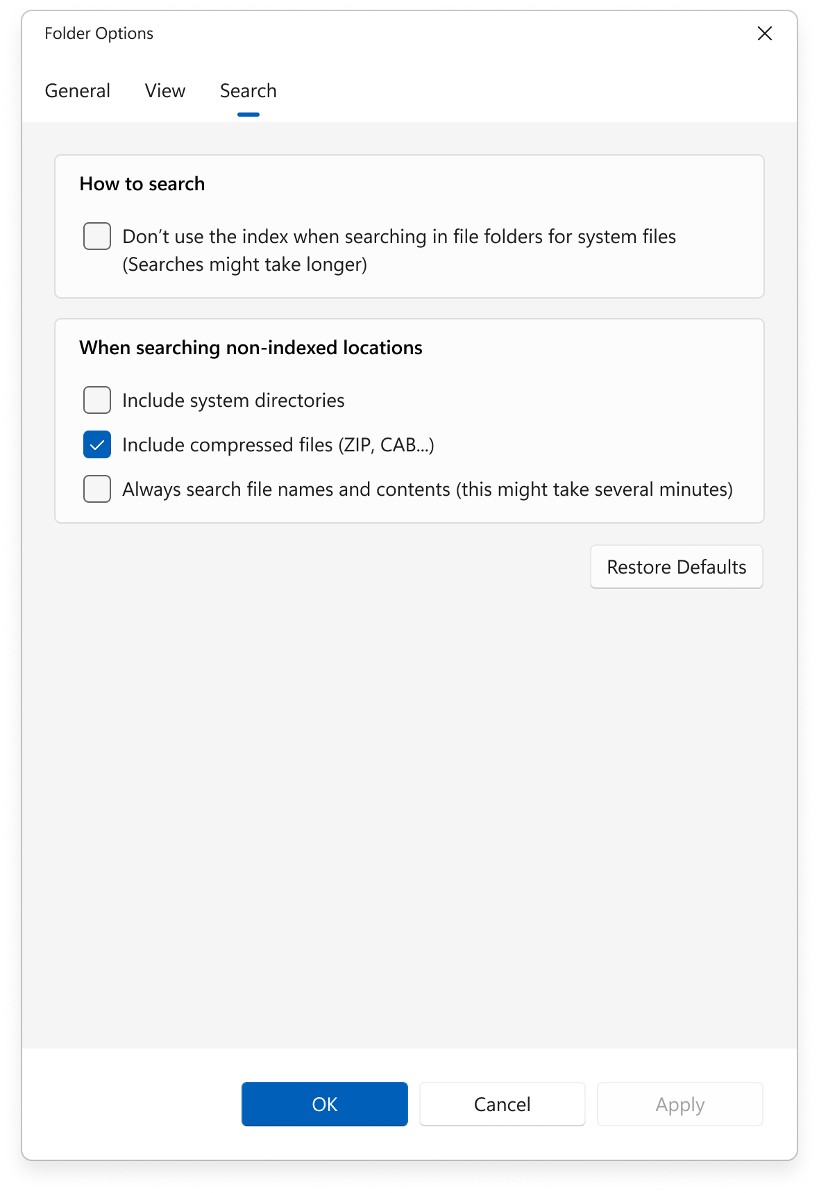
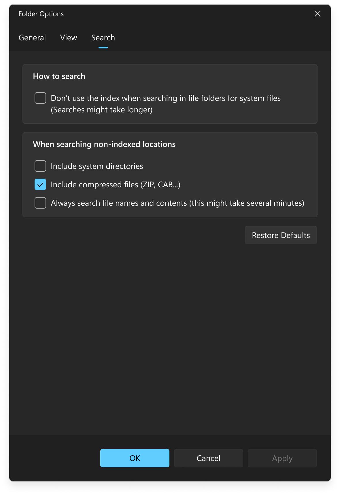
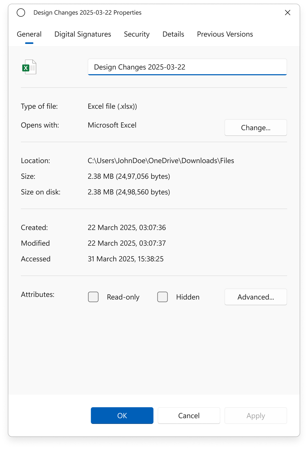
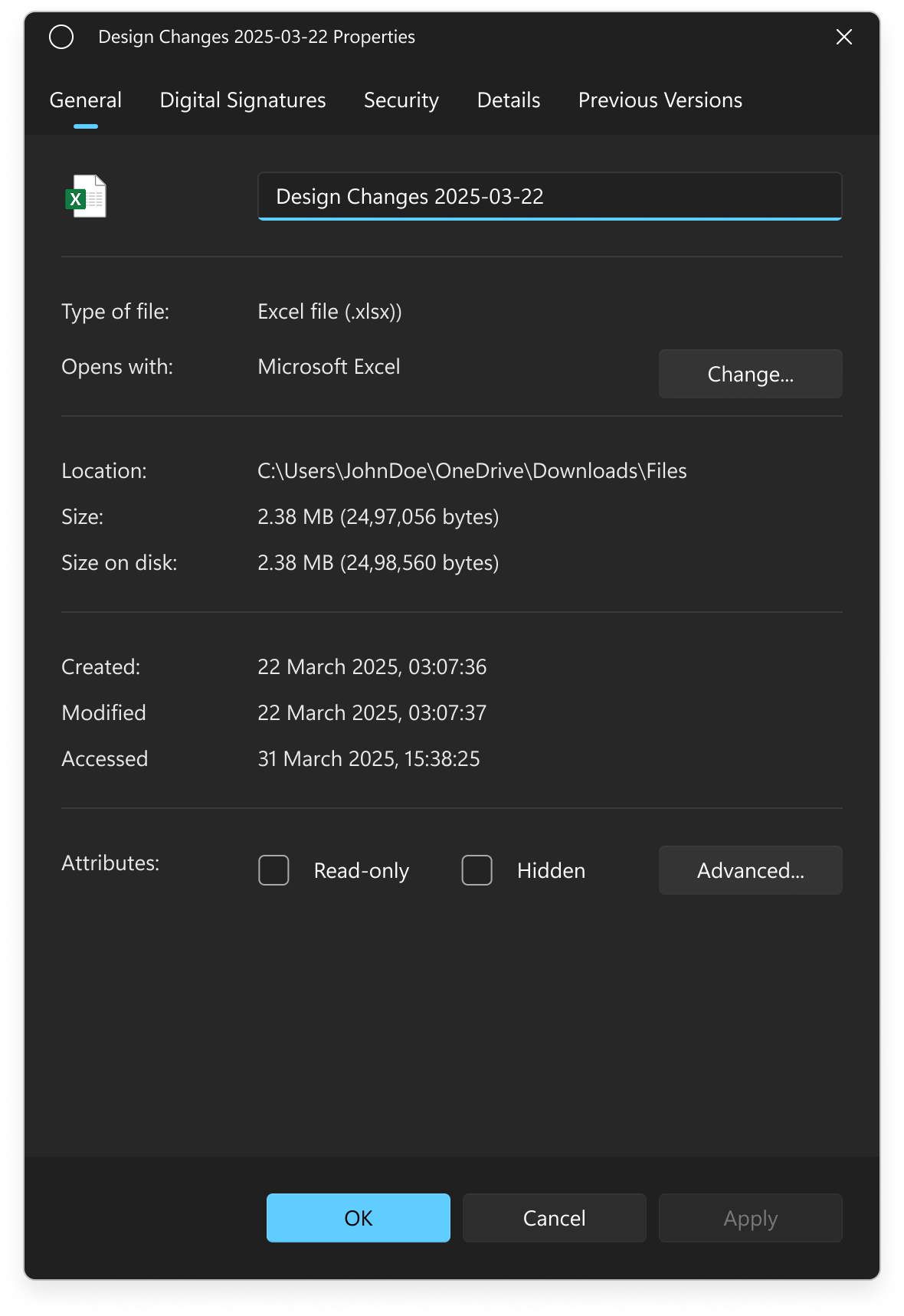
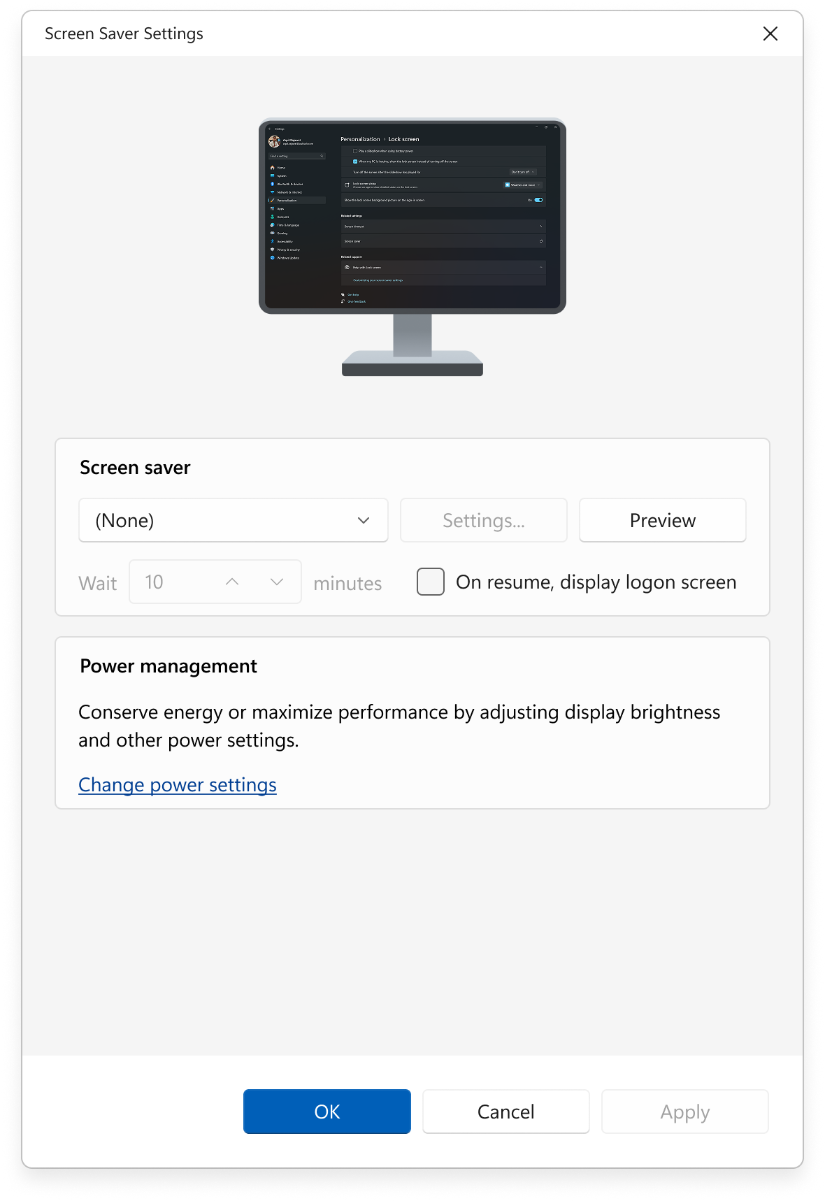
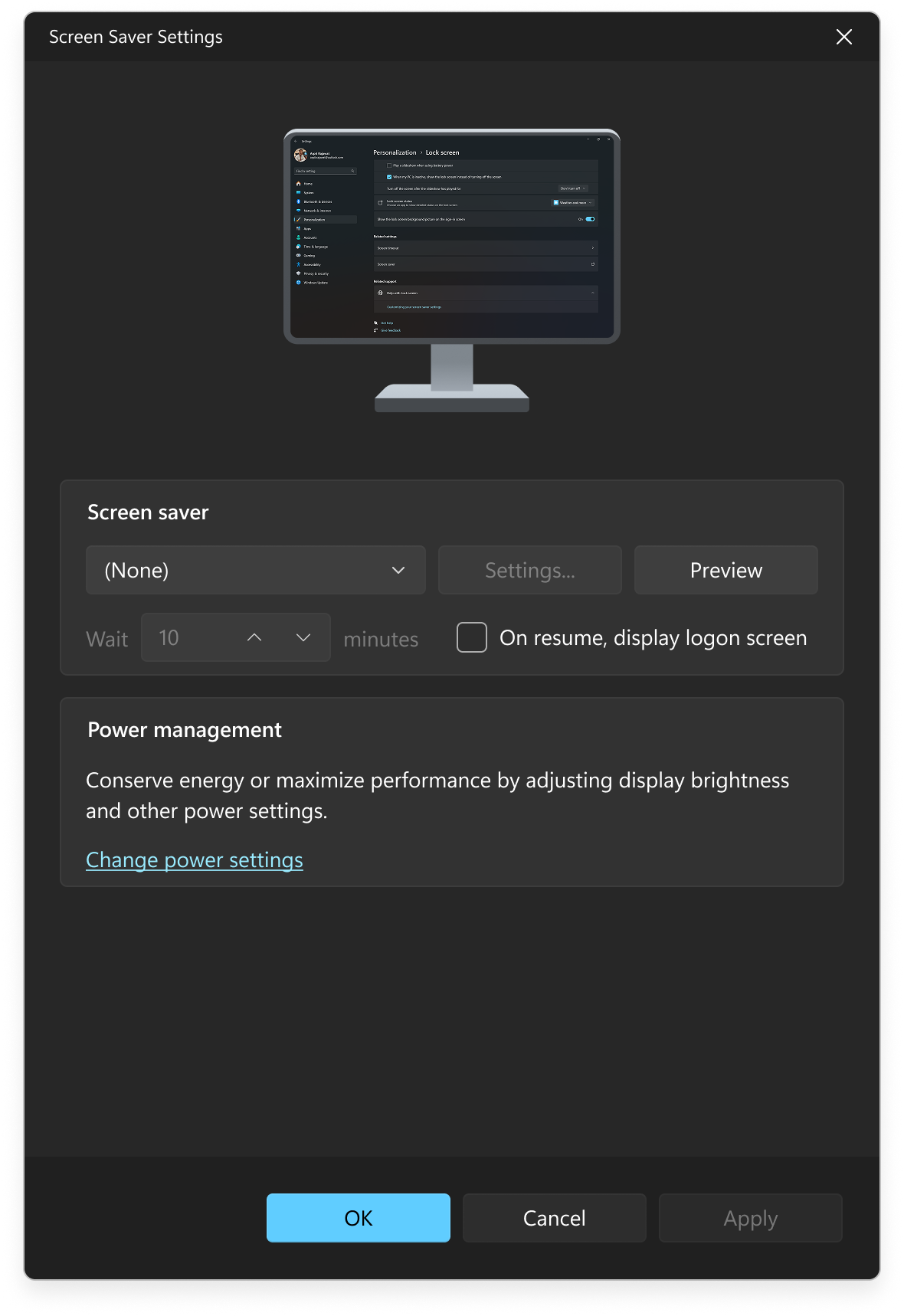
😥 Dialogs and System Prompts
-
Mixed UI Styles –
Dialogs vary in appearance—some use
Fluent Design with rounded corners and shadows, others retain Metro or classic
Win32 styles, creating a fragmented and outdated feel within the same platform.
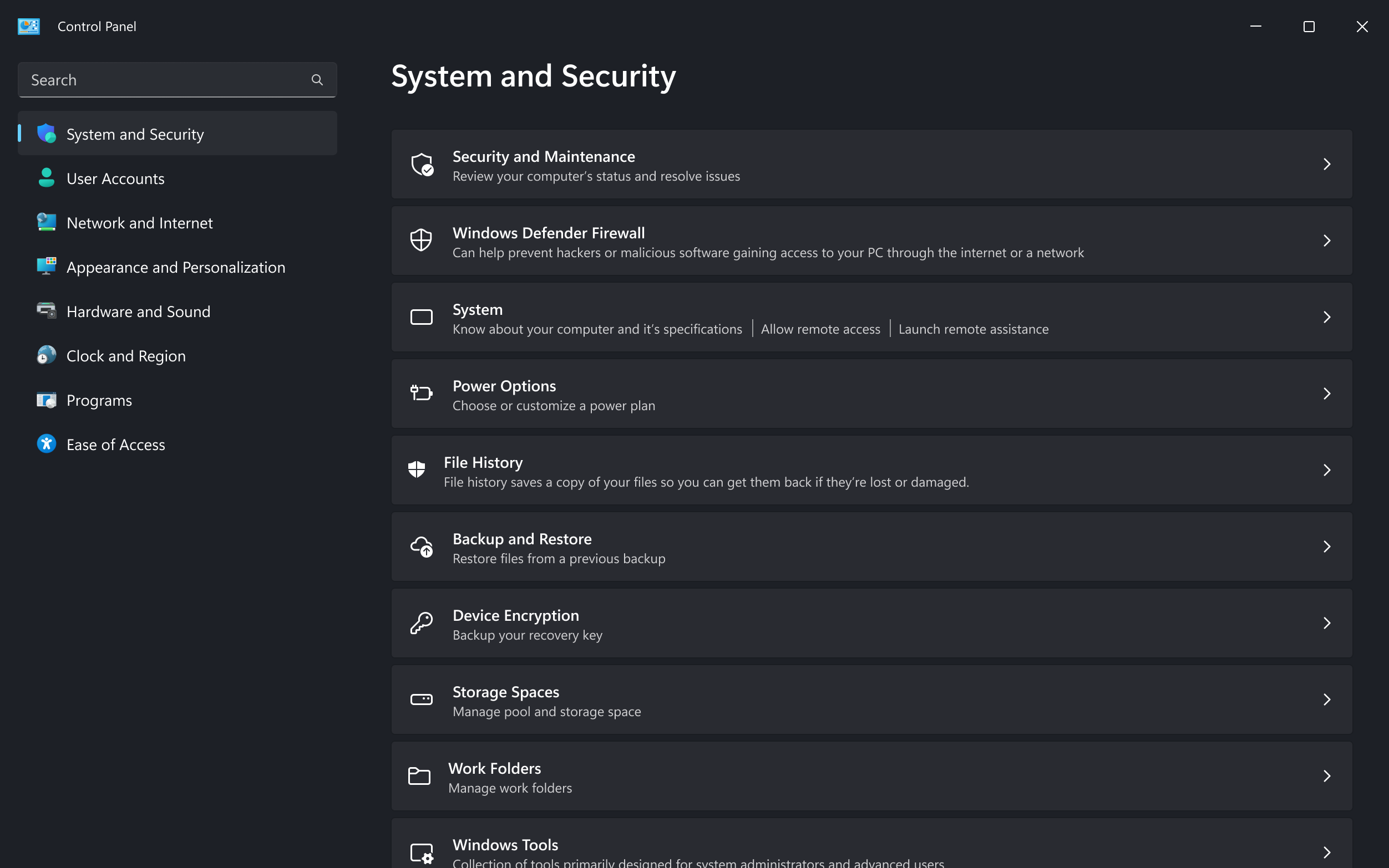
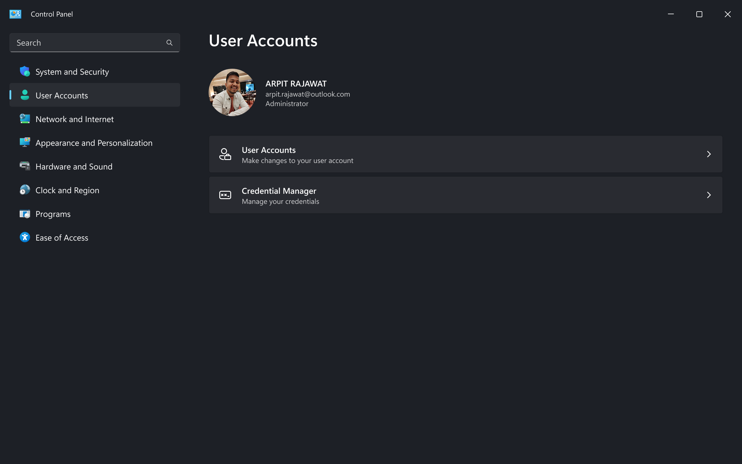
-
Lack of Dark Mode Support –
Many older dialogs don’t
support dark mode, causing abrupt and confusing theme changes when switching
between modern and legacy interfaces.
-
Non-responsive Scaling –
Older dialog boxes and alert
prompts do not scale properly on high-DPI displays, often appearing blurry,
cropped, or with misaligned UI elements.
-
Outdated System tools –
Tools like Task Scheduler, Device
Manager, and Disk Management retain legacy layouts with outdated UI paradigms,
missing visual and interaction updates.
Competitive Analysis
To check and compare the other OS interfacess, I've conducted a competitive analysis by using 2
other popular OS (macOs & Linux-Gnome) interfaces to check the inconsistencies and gap in
the experiences.
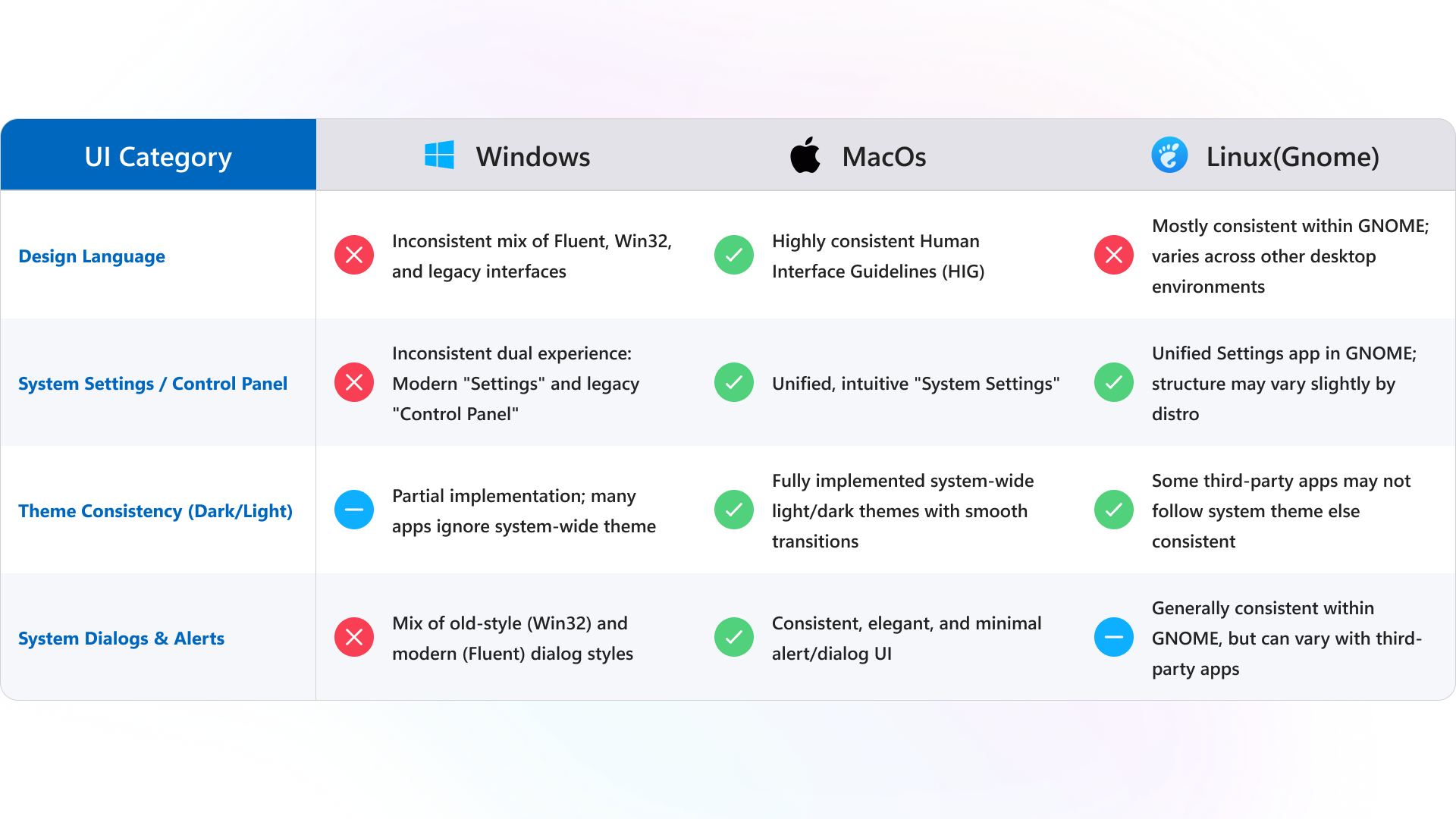
UI inconsistencies after Interface Audit
During the interface audit of Windows UI, several inconsistencies were identified across
different system components. These include variations in iconography, spacing, button styles,
and alignments especially between legacy "Control Panel" interfaces and newer "Settings"
screens. Additionally, there are mismatches in dark/light theme implementation and inconsistent
use of system dialogs. These inconsistencies can disrupt the user experience by creating
confusion, reducing trust, and affecting overall usability for users.